Mirizlivo
Case Study
portfolio
about
label design
Marketing design
Social Media visuals
illustration
Motion Graphics
Results & Deliverables
- Contribution to a successful product launch.
- Building long-term partnerships.
Mirizlivo
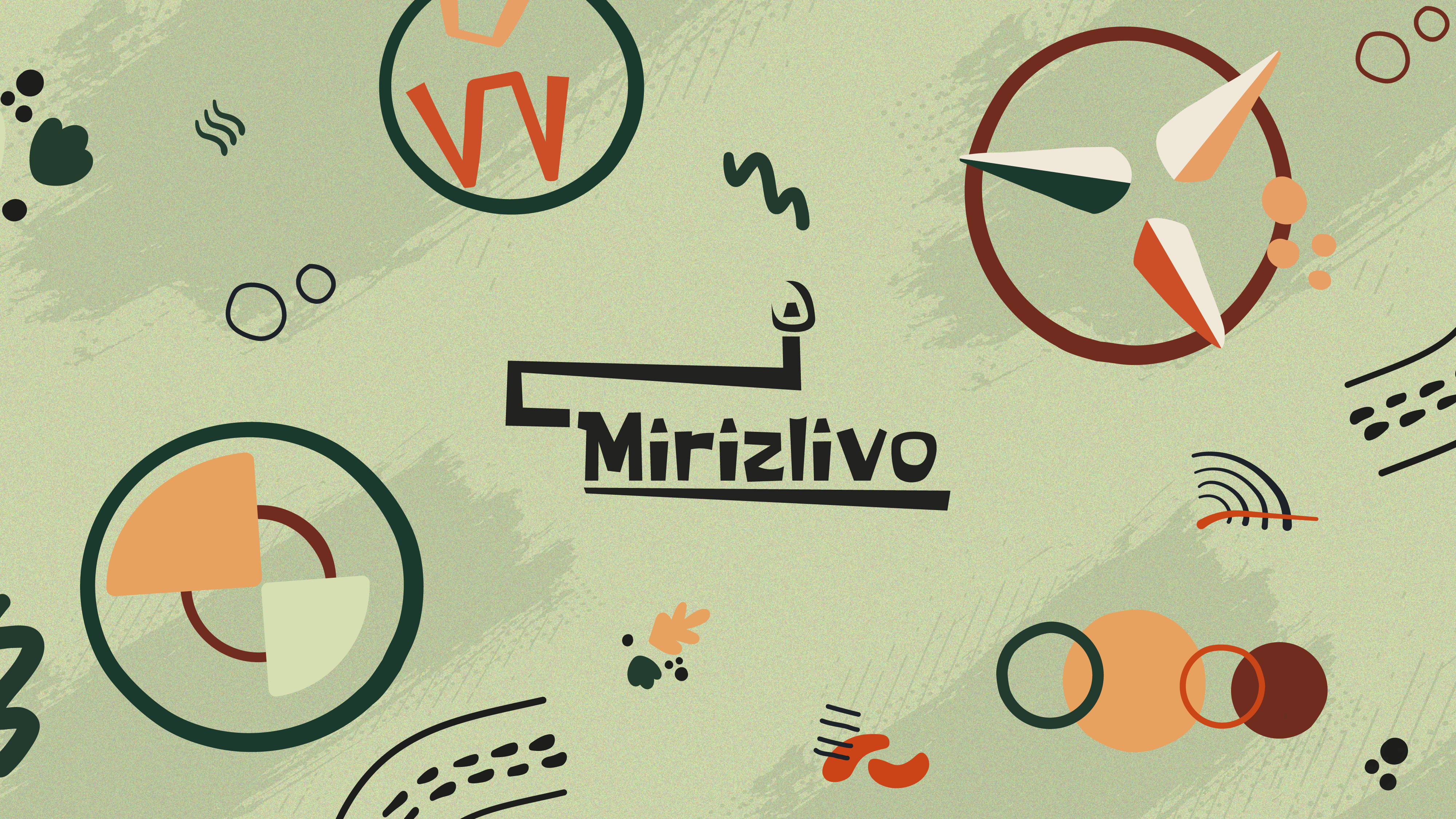
Mirizlivo is a brand creating eco-friendly aroma candles in a can. What is unique about them, except for the packaging, is that they have witty messages placed on the labels, making them a creative present for many occasions.
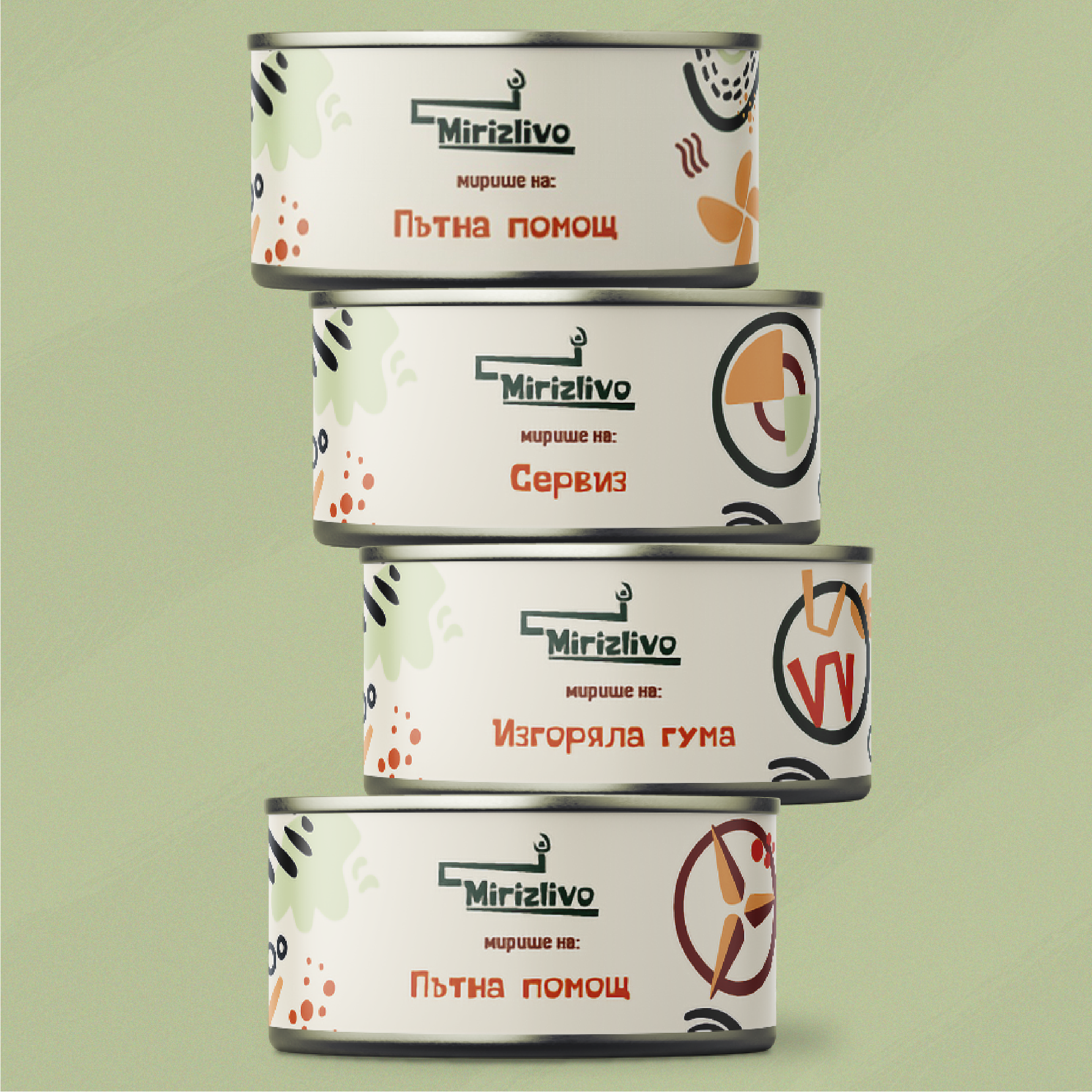
The company owners reached out to me asking for label design and marketing visuals for the launch of their new product line for car enthusiasts. The label needed 4 variations for popular brands- Audi, Mercedes, BMW, and Volkswagen, plus one general. The messages’ copies, which were provided, were based on unfortunate situations like a flat tyre, but written in their typical whimsical tone of voice.
The Challenge
The main challenge was to introduce a new visual story around the car culture, which is typically masculine and sleek, within a brand that is warm and whimsical. The candle labels from previous product launches all had the same composition with elements from a defined illustration library. It was a requirement to stick to the same design and blend the new ones with the rest seamlessly.
Design Process
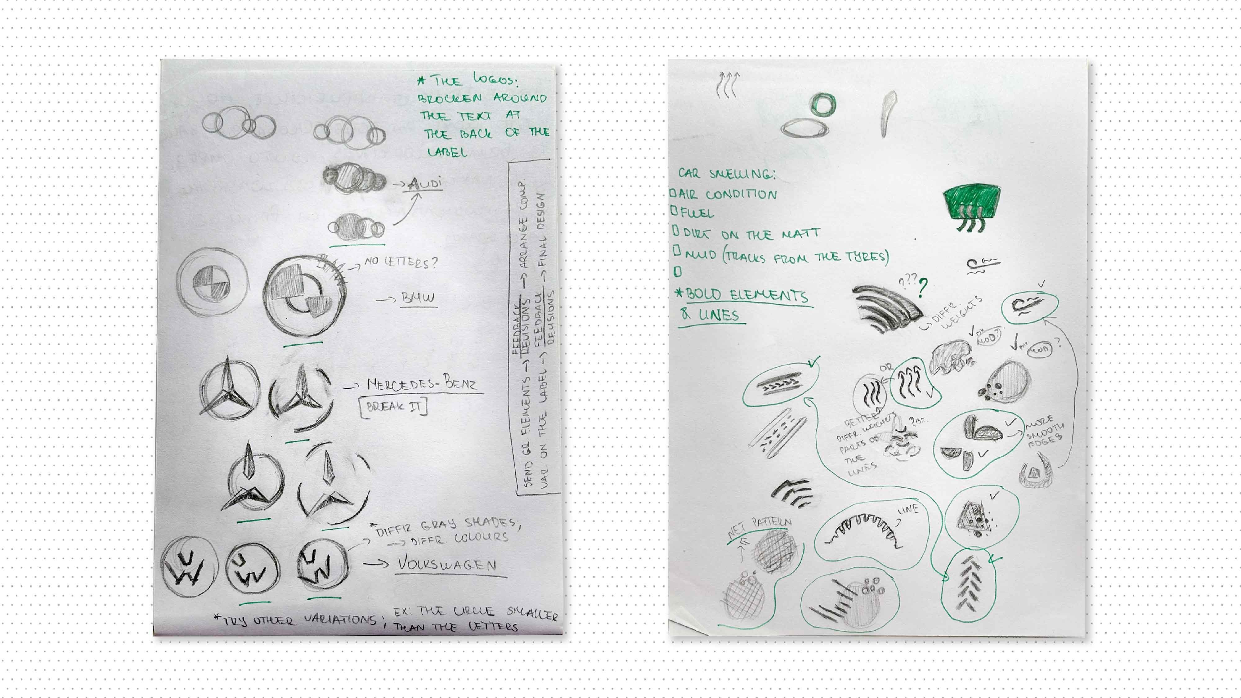
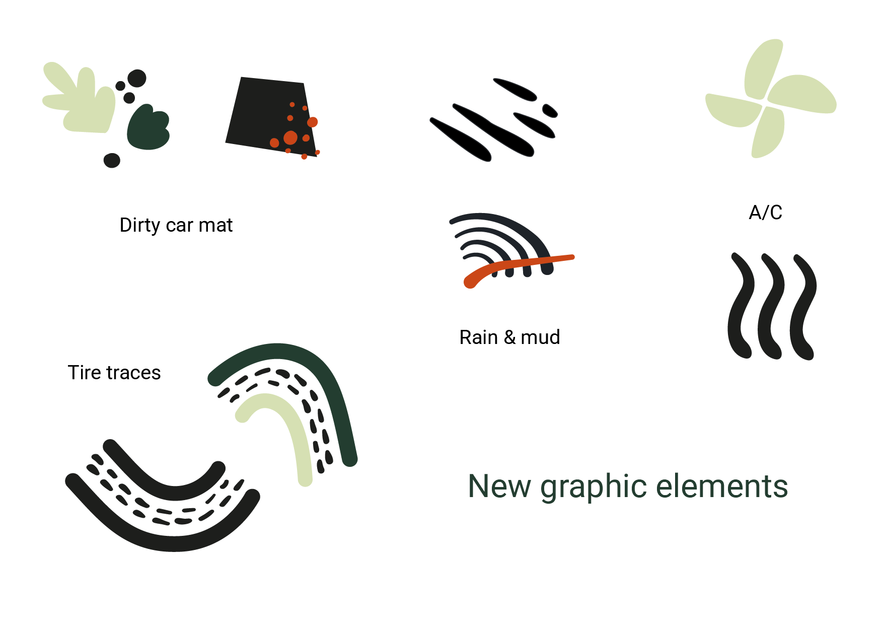
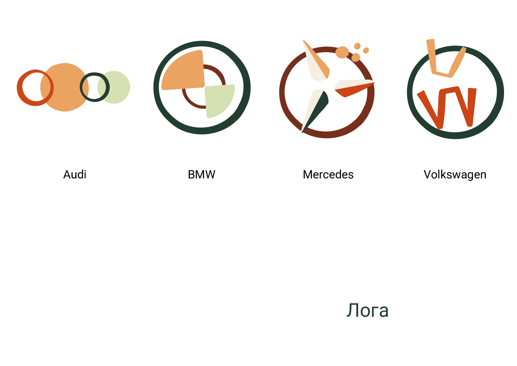
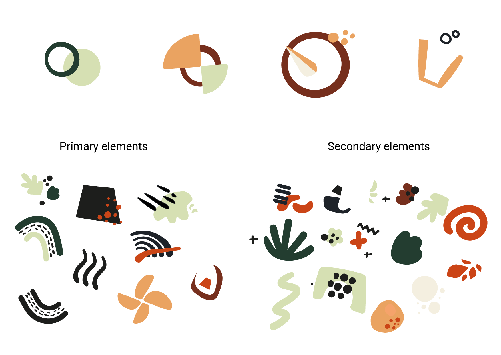
I started by breaking down the car logos into basic shapes, which I edited to fit the visual style of the brand illustrations. I placed the logo compositions on the right of the main message, creating a secondary focal point on the label. I also created new assets inspired by the act of driving a car and all the things that can make it dirty and smelly on the road.
Label Design

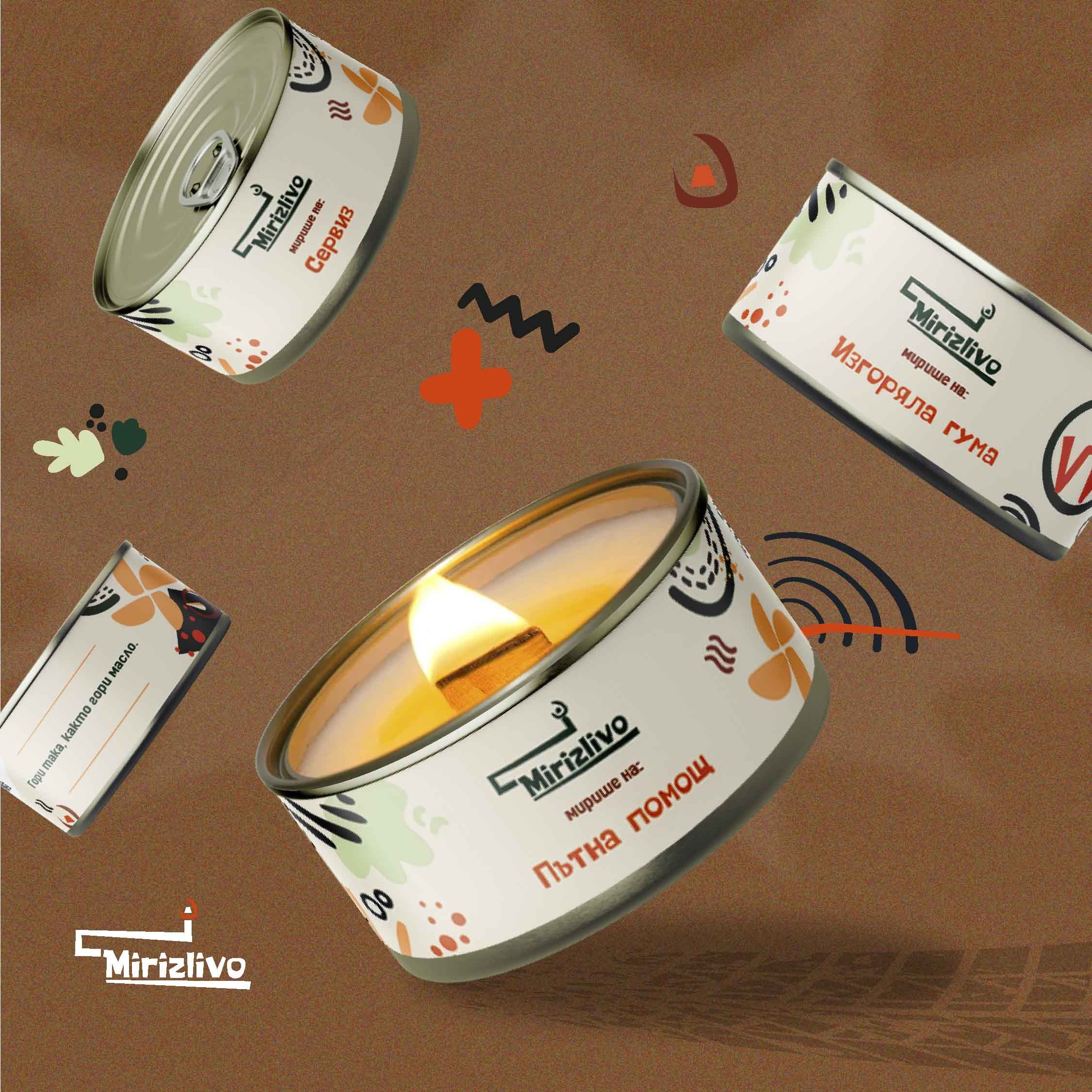
Car brand logo as a secondary focus.
Witty message: “It burns like oil”.
Primary focus- the smell of the candle:
“It smells like: Roadside Assistance”
Dynamic composition of the main elements.

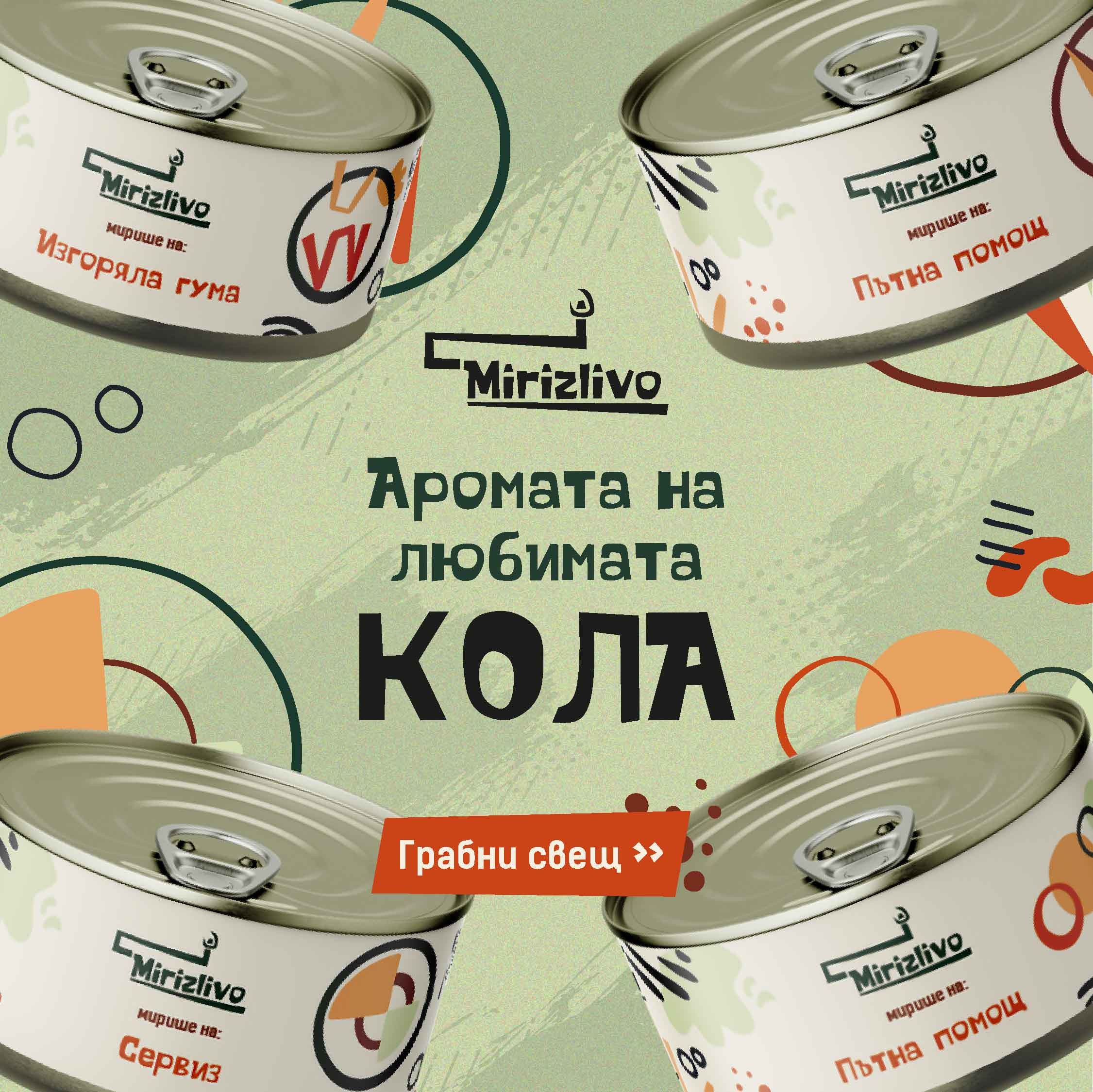
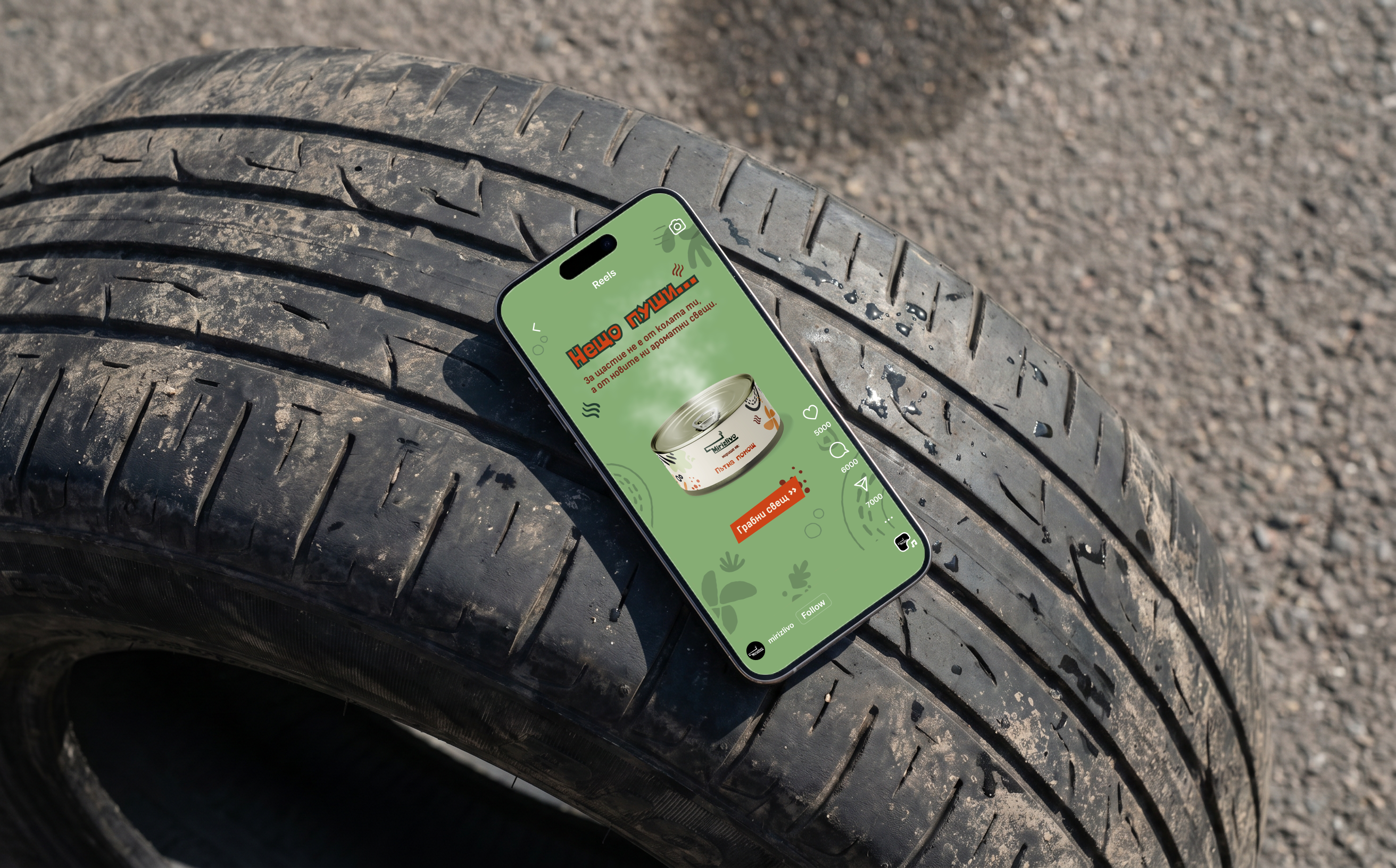
Social Media &
Google Ads
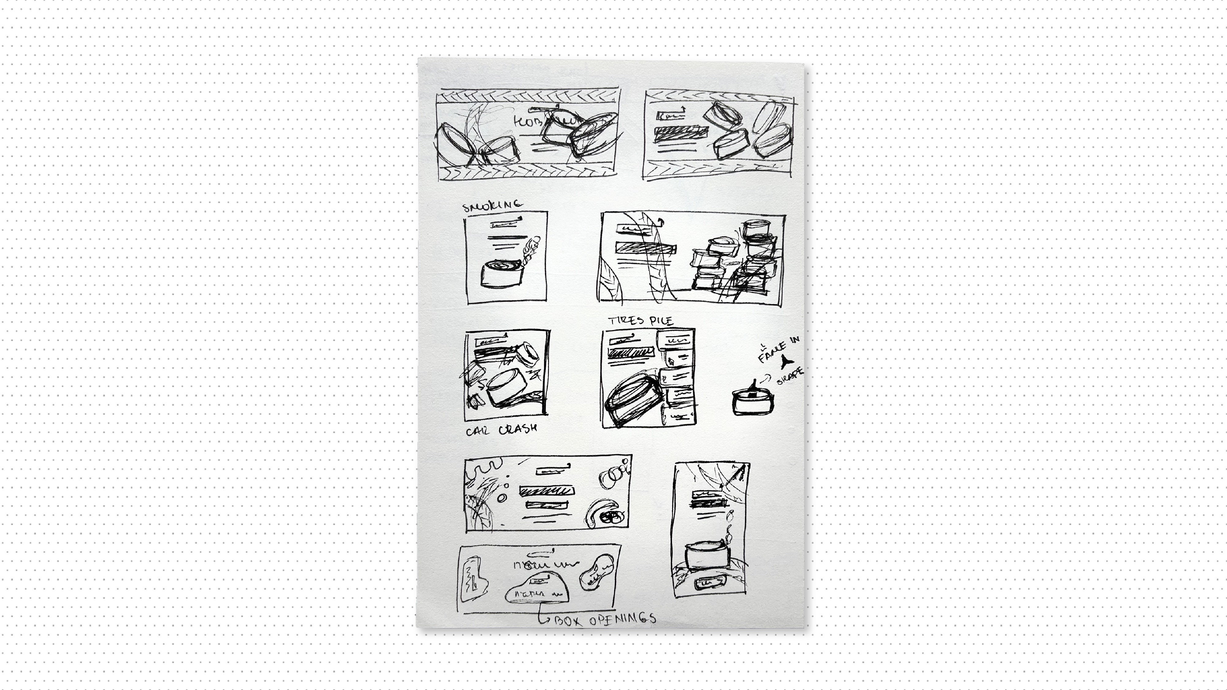
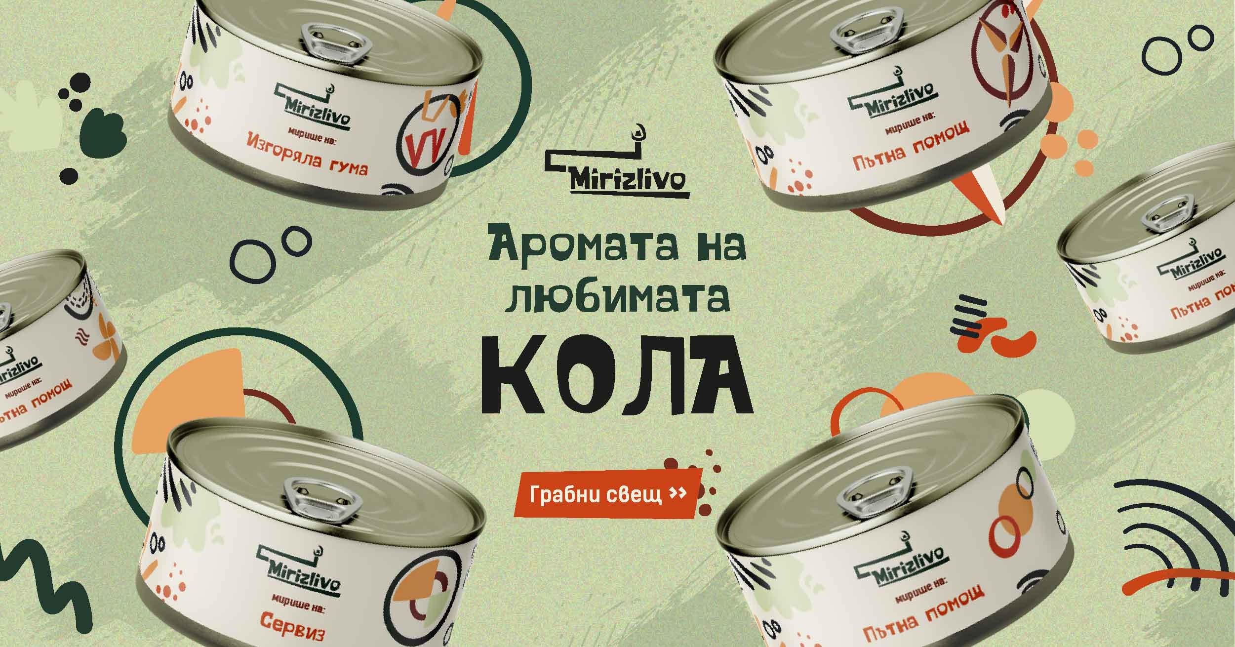
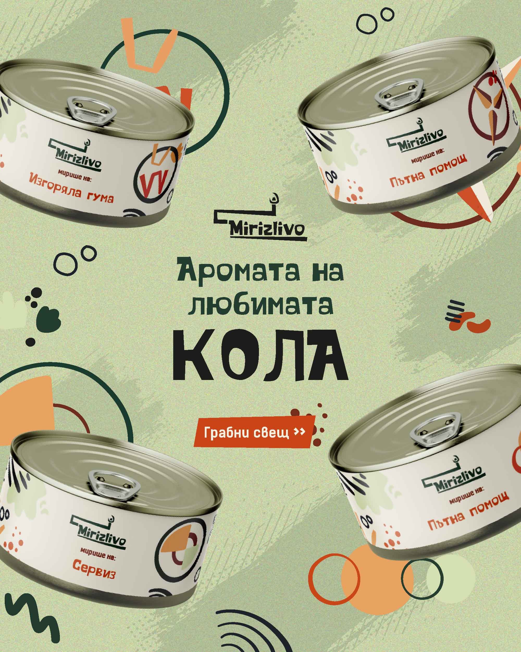
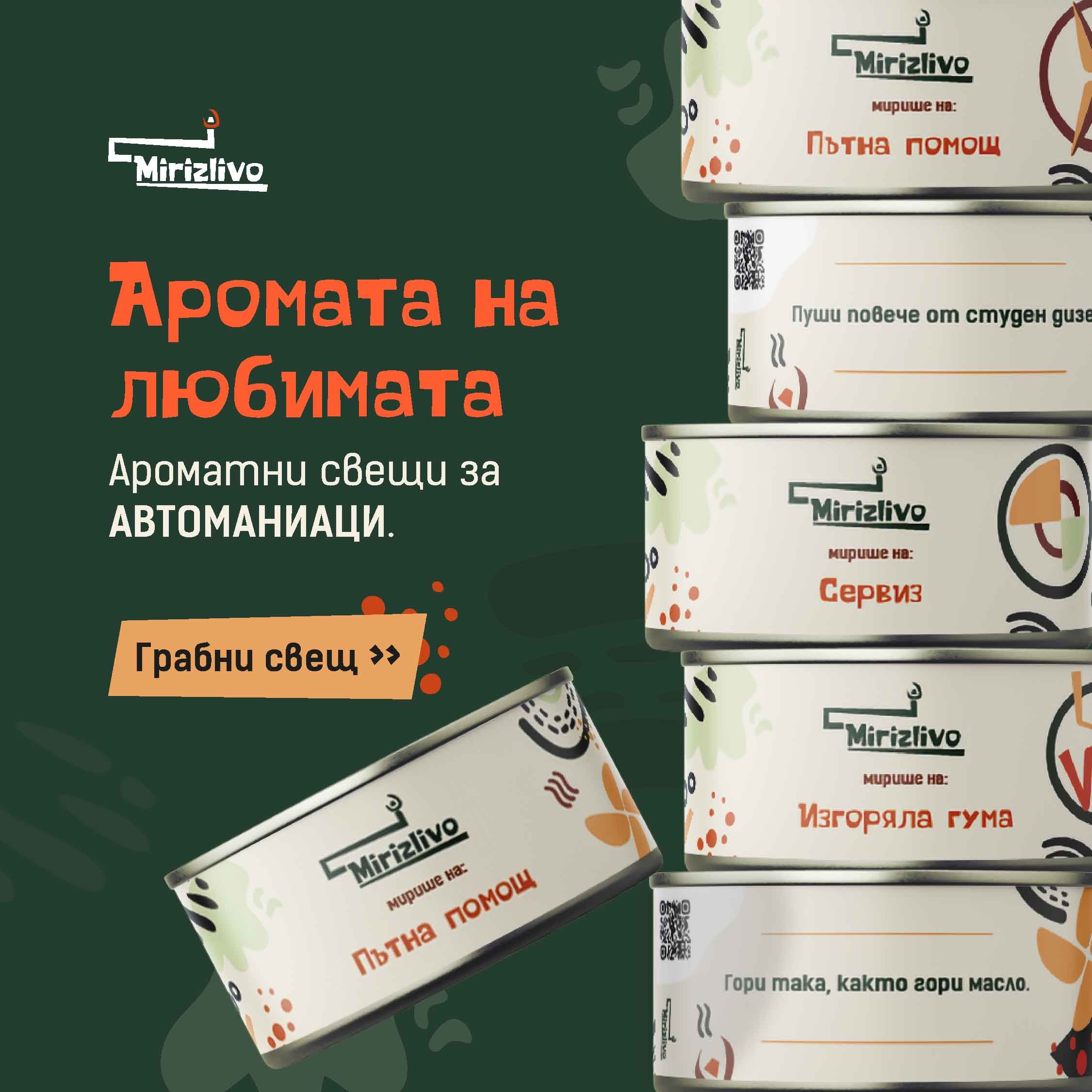
The concept behind the marketing campaign was inspired by the tire stacks, as the shape of the car tire is visually similar to the shape of the candle can. I followed the brand guidelines, creating whimsical and dynamic compositions with textured backgrounds and graphic elements from the expanded brand library.





mirizlivo



mirizlivo

5000

6000

7000



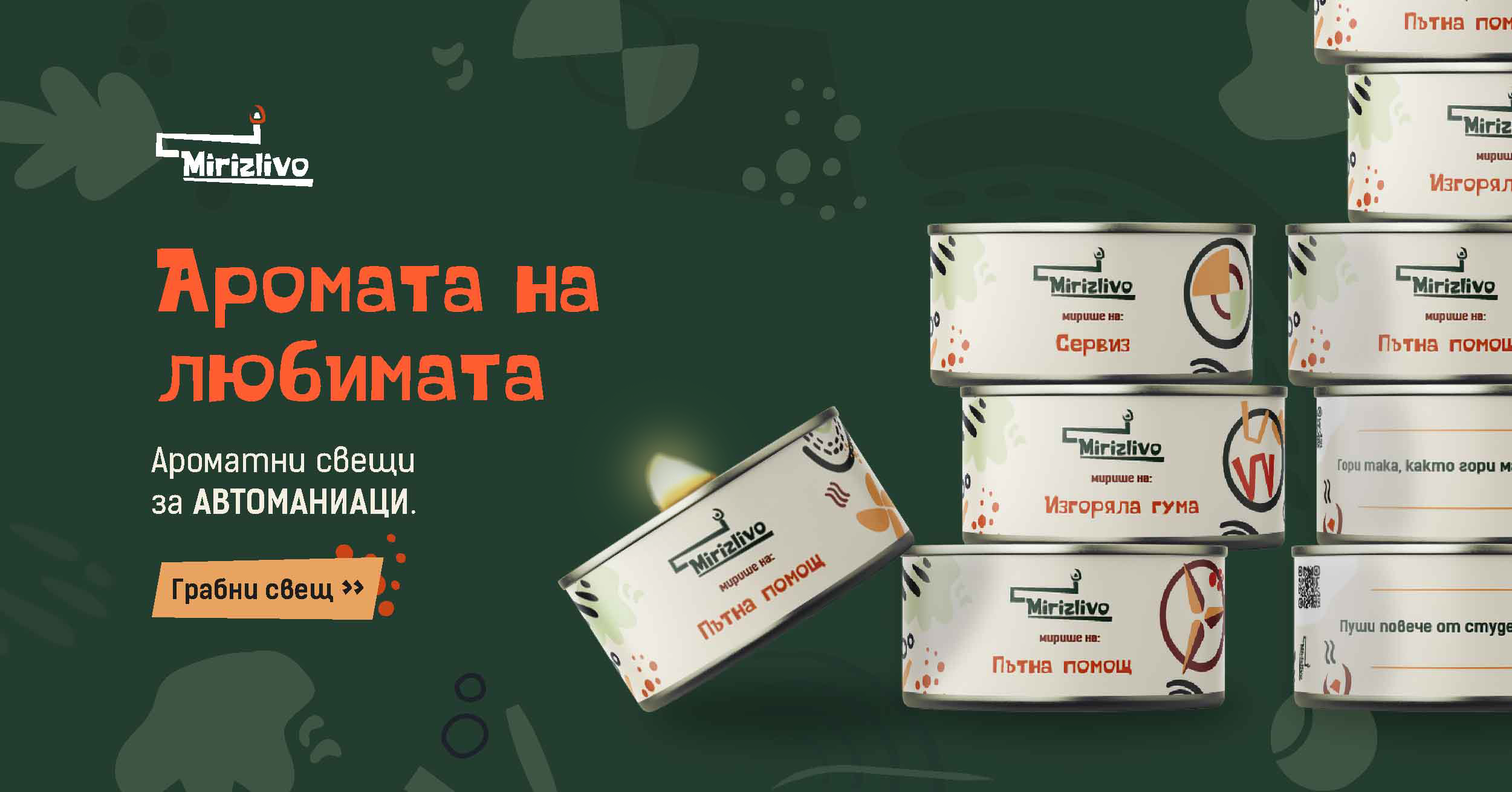
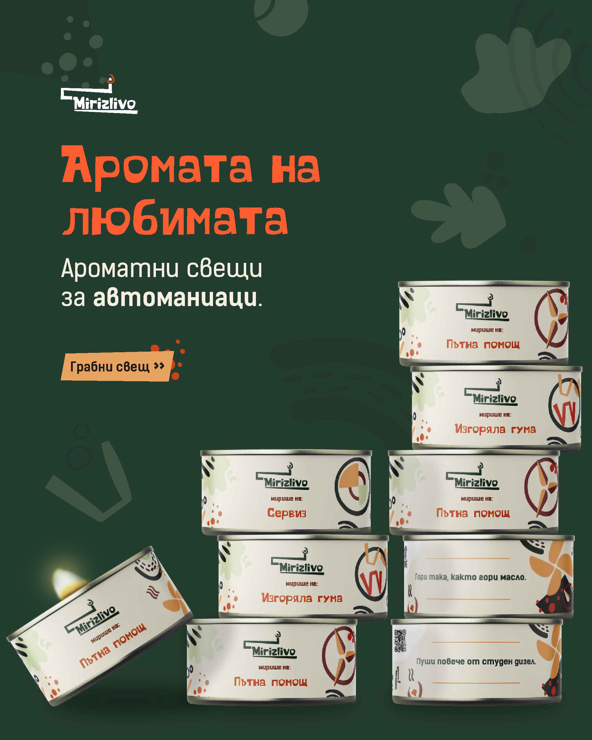
Responsive Display Google Ads
Vertical (4:5)
960 x 1200
Square (1:1)
1200 x 1200
Landscape (1.91:1)
1200 x 628
Results
The expansion of the illustration library was a necessary step for creating distinctive visuals for the new line while staying on brand. I had a lot of fun with this project, and so did the clients who approved the designs on the first round. They contacted me again later to design the packaging for their new product- car air fresheners.

next case study
back to homepage
Katerina Kirilova
kreationkeen@gmail.com


portfolio homepage
kreationkeen@gmail.com
Mirizlivo Case Study
portfolio
about
label design
Marketing design
Social Media visuals
illustration
Motion Graphics
Results & Deliverables
- Contribution to a successful product launch.
- Building long-term partnerships.
Mirizlivo
Mirizlivo is a brand creating eco-friendly aroma candles in a can. What is unique about them, except for the packaging, is that they have witty messages placed on the labels, making them a creative present for many occasions.
The company owners reached out to me asking for label design and marketing visuals for the launch of their new product line for car enthusiasts. The label needed 4 variations for popular brands- Audi, Mercedes, BMW, and Volkswagen, plus one general. The messages’ copies, which were provided, were based on unfortunate situations like a flat tire, but written in their whimsical tone of voice.
The Challenge
The main challenge was to introduce a new visual story around the car culture, which is typically masculine and sleek, within a brand that is warm and whimsical. The candle labels from previous product launches all had the same composition with elements from a defined illustration library. It was a requirement to stick to the same design and blend the new ones with the rest seamlessly.
Design Process
I started by breaking down the car logos into basic shapes, which I edited to fit the visual style of the brand illustrations. I placed the logo compositions on the right of the main message, creating a secondary focal point on the label. I also created new assets inspired by the act of driving a car and all the things that can make it dirty and smelly on the road.
Label Design
Car brand logo as a secondary focus.
Witty message: “It burns like oil”.
Primary focus- the smell of the candle:
“It smells like: Roadside Assistance”
Dynamic composition of the main elements.

Social Media &
Google Ads
The concept behind the marketing campaign was inspired by the tire stacks, as the shape of the car tire is visually similar to the shape of the candle can. I followed the brand guidelines, creating whimsical and dynamic compositions with textured backgrounds and graphic elements from the expanded brand library.


mirizlivo

mirizlivo

mi
mirizlivo
mi
Follow

5000

6000

7000


Reels

Responsive Display Google Ads
Vertical (4:5)
960 x 1200
Square (1:1)
1200 x 1200
Landscape (1.91:1)
1200 x 628
Results
The expansion of the illustration library was a necessary step for creating distinctive visuals for the new line while staying on brand. I had a lot of fun with this project, and so did the clients who approved the designs on the first round. They contacted me again later to design the packaging for their new product- car air fresheners.

back to homepage
next case study
Katerina Kirilova
kreationkeen@gmail.com