Finmi
Case Study
portfolio
about
ux/ui design
Design System
Visual Identity
digital Product Design
Responsive web design
Results & Deliverables
- A functional design system that can be applied across physical and digital products.
finmi
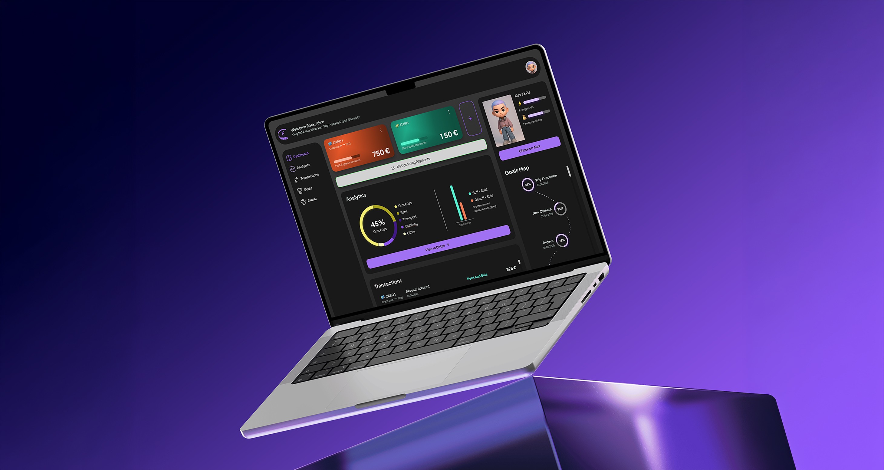
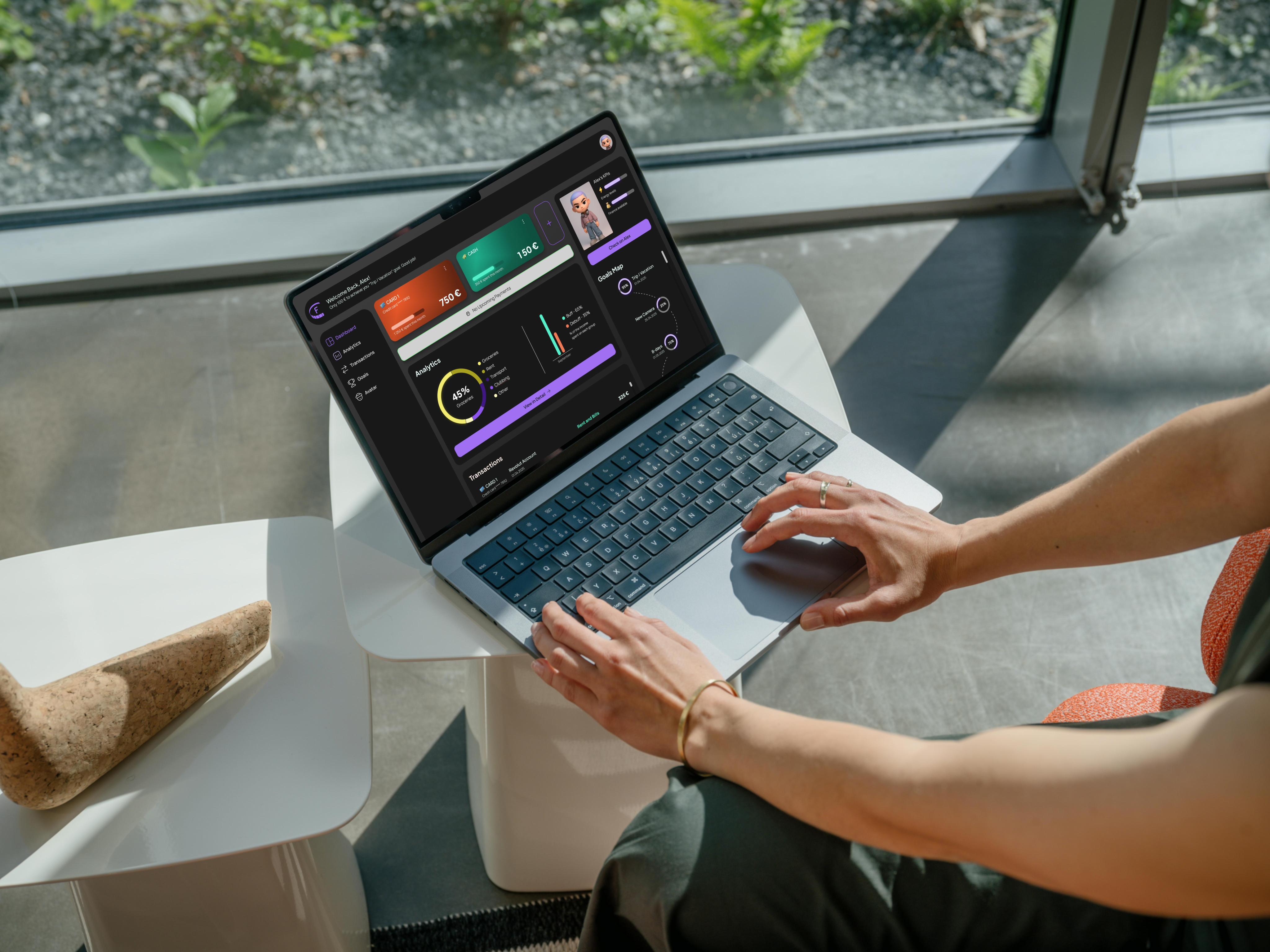
Finmi is a web-based finance tracker that fills the gap between boring budgeting dashboards and over-gamified habit apps. The app’s mission is to empower young adults to take control of their spending through clear visual feedback and positive reinforcement.
I created a scalable design system with interactive UI components and high-fidelity prototypes of the app in Figma. The assets have been later applied across all brand products.
The Problem
The idea for this digital product came to me after listening to my peers always complain about not having any money left toward the end of the month. Therefore, I decided to create a digital product that shows visually how small daily habits affect personal finances.

Target Users
- University students and recent graduates (18–28 years old).
- Young adults with limited financial literacy or irregular income.
- Ambitious users who enjoy personalized, visual, and interactive digital tools.

Research
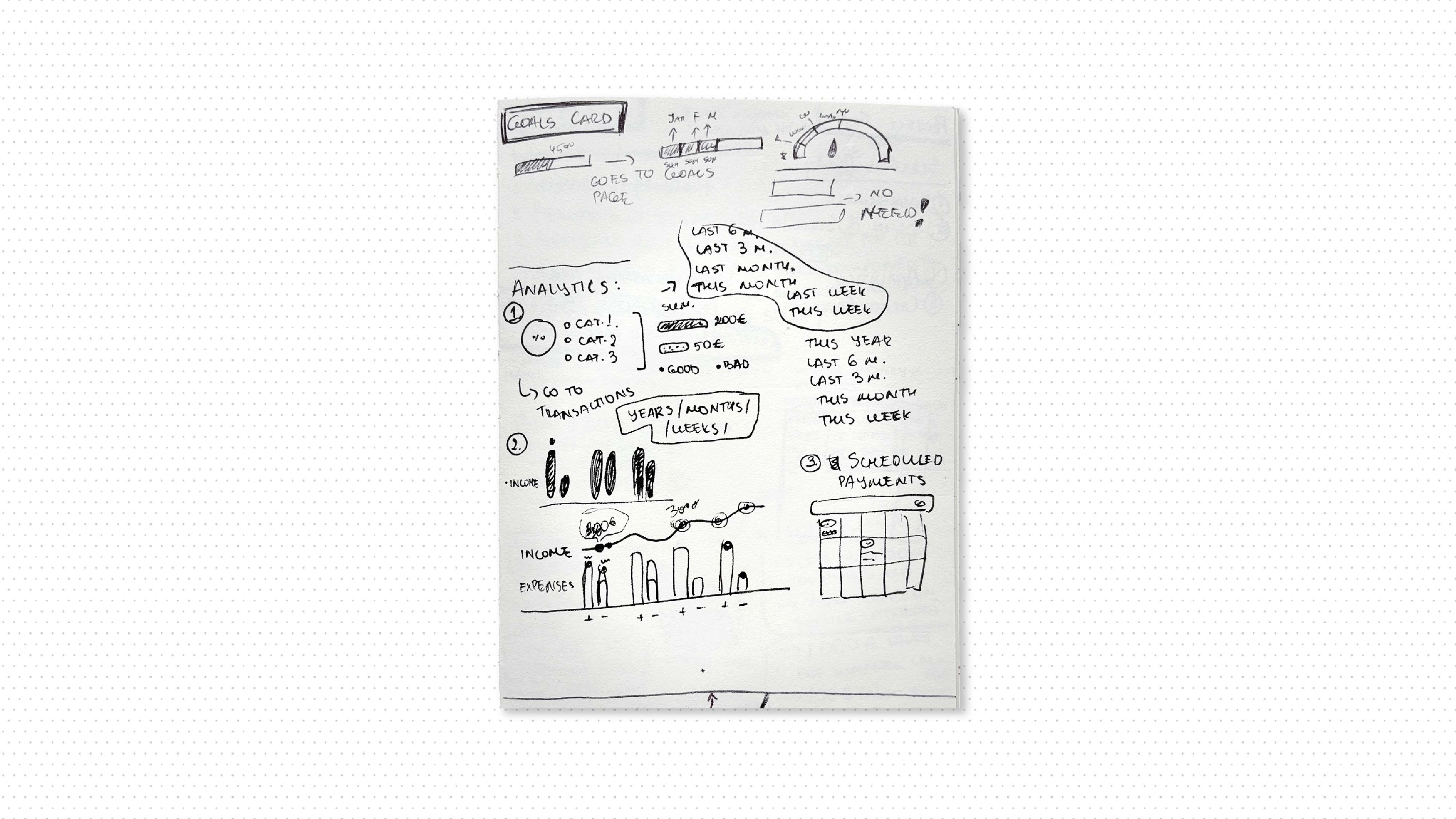
The majority of the finance apps’ dashboards consist of graphs, charts, and tables predominantly, while some habit trackers have too gamified user interfaces, not built for clear financial data display. Therefore, I combined simply designed infographics with a colour-based feedback system, literal 3D icons, and customizable avatars to ensure clear visual feedback and achieve an inviting and easy-to-navigate interface for the target users.
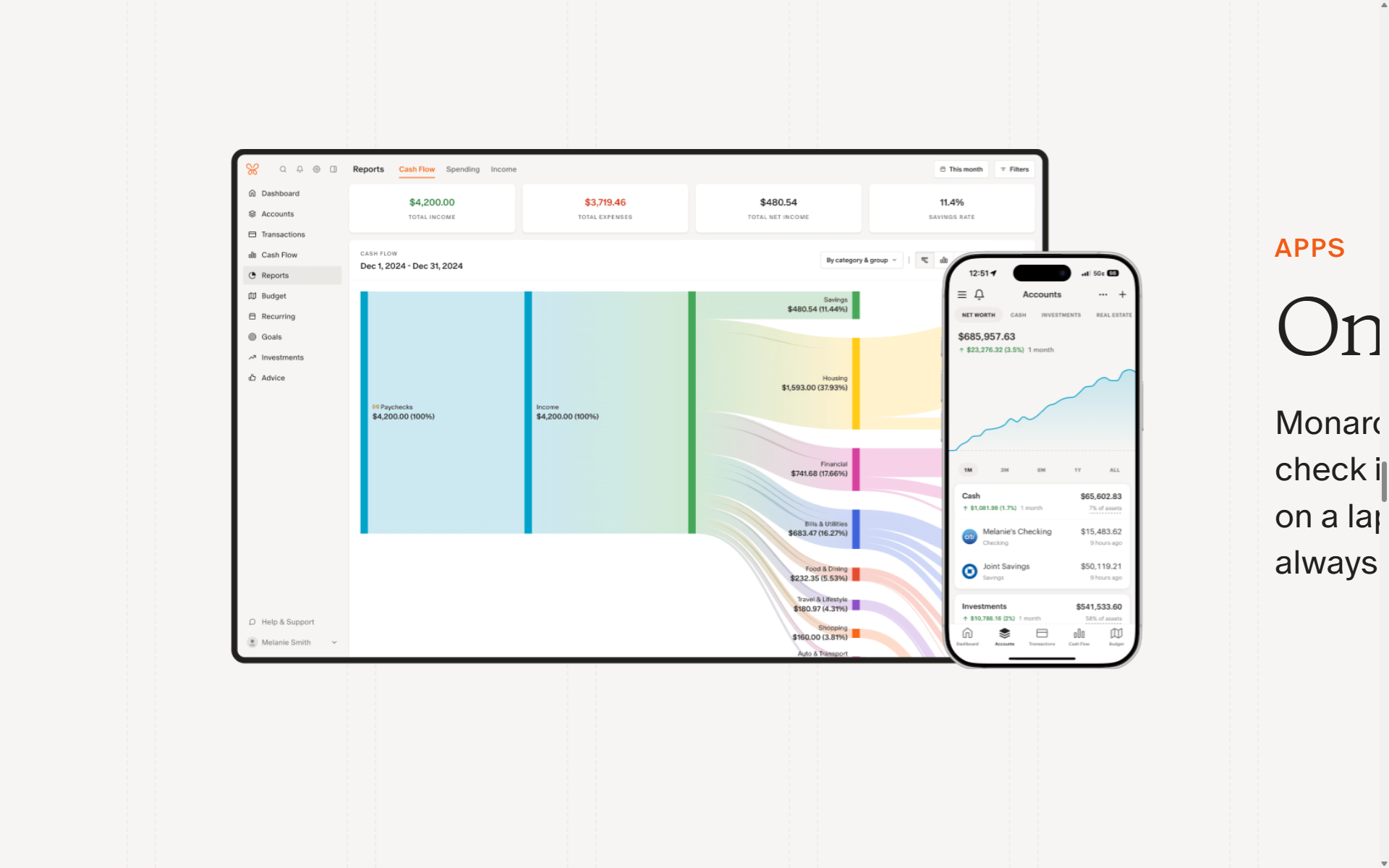
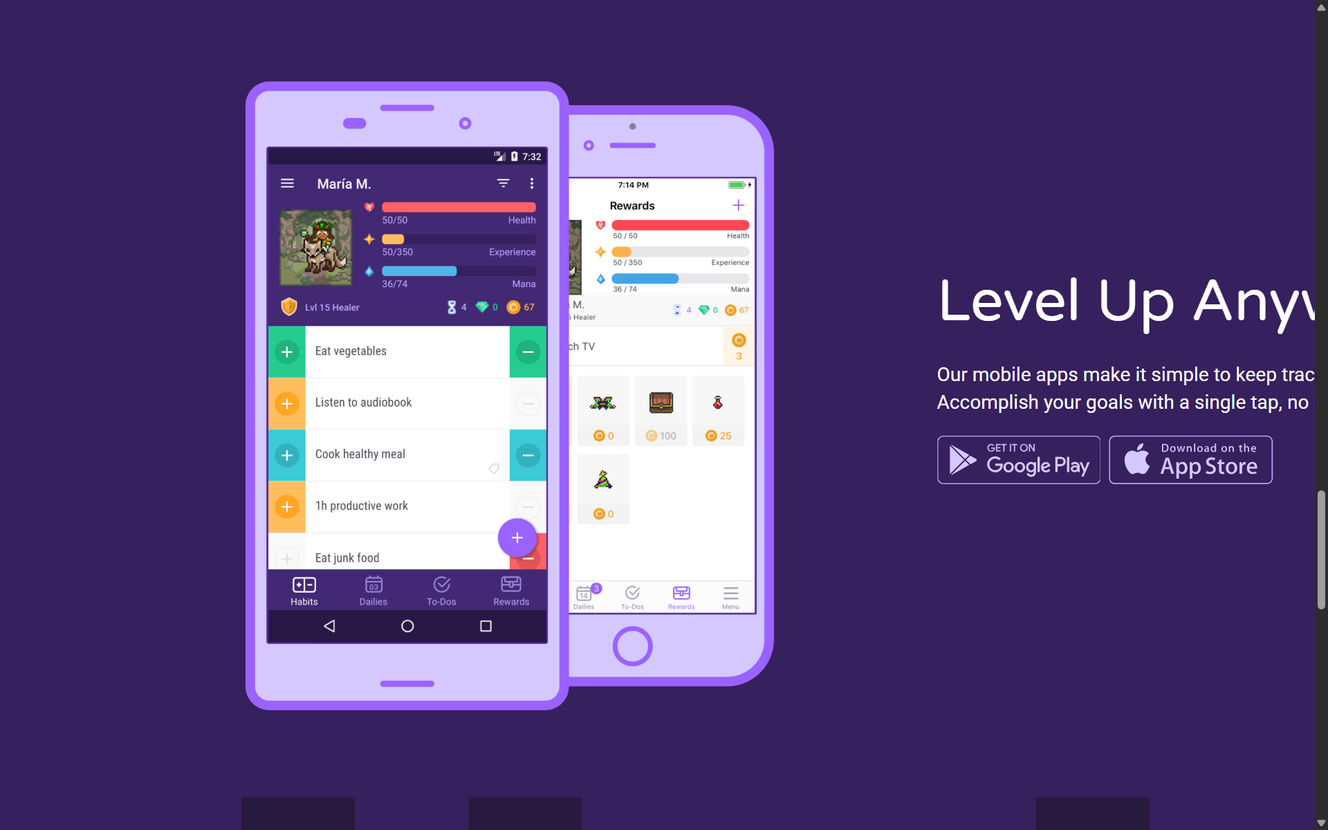
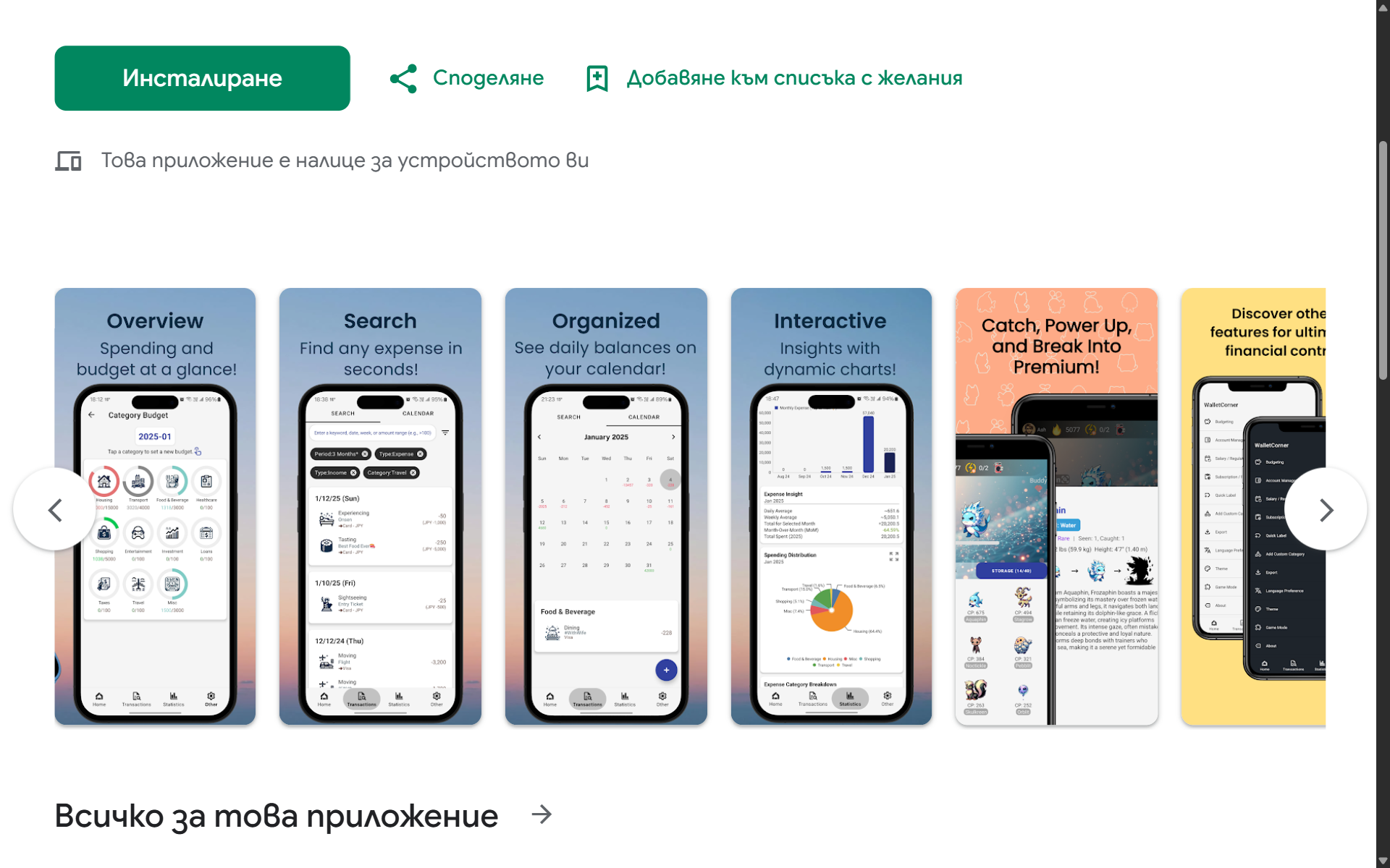

Sketching out simple charts and UI components.
Brand Design Strategy
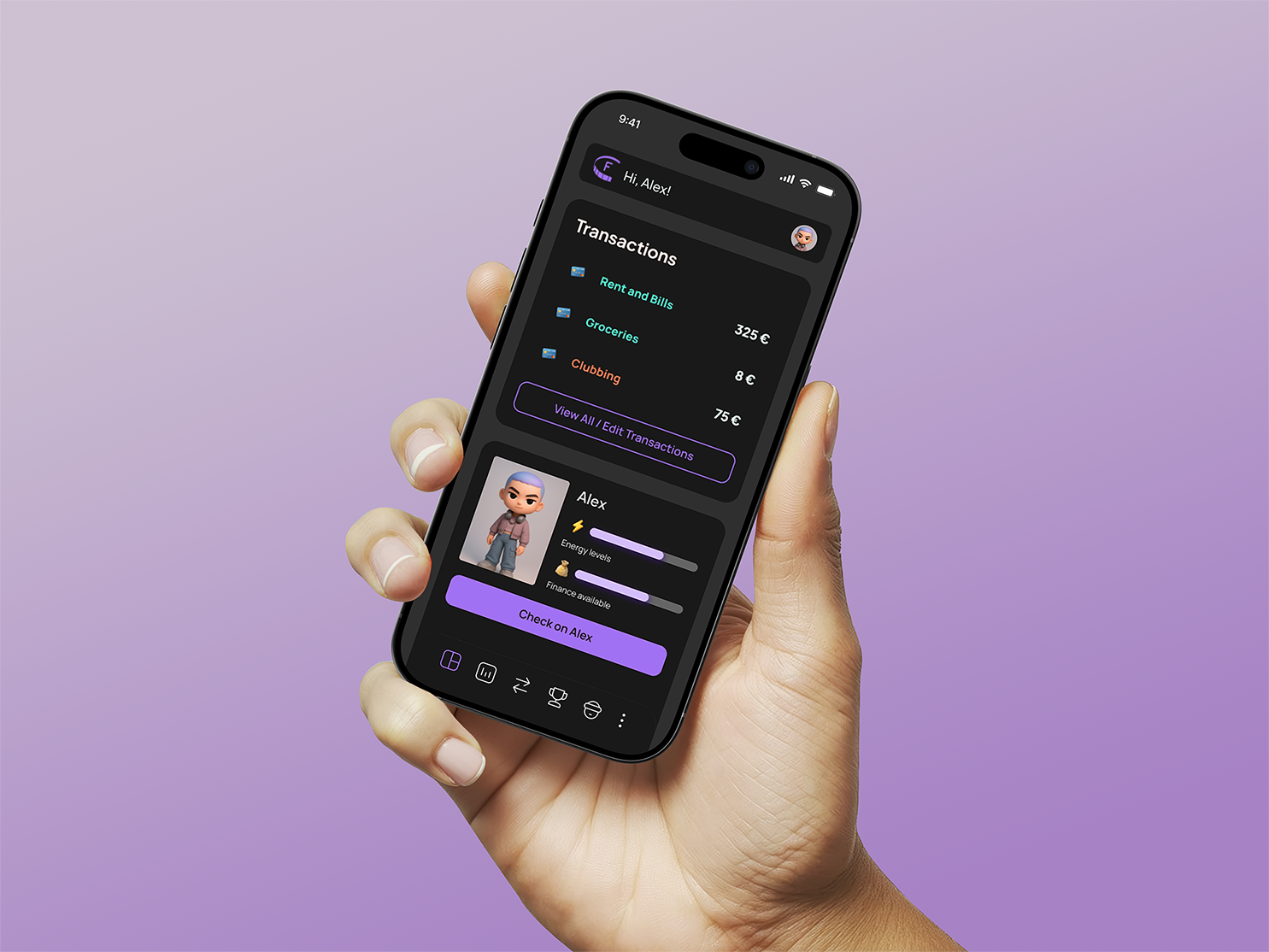
The product brand concept was developed around blending the digital with the real world, giving immediate feedback on spending. It was important to make the process of using the app as easily accessible as posible
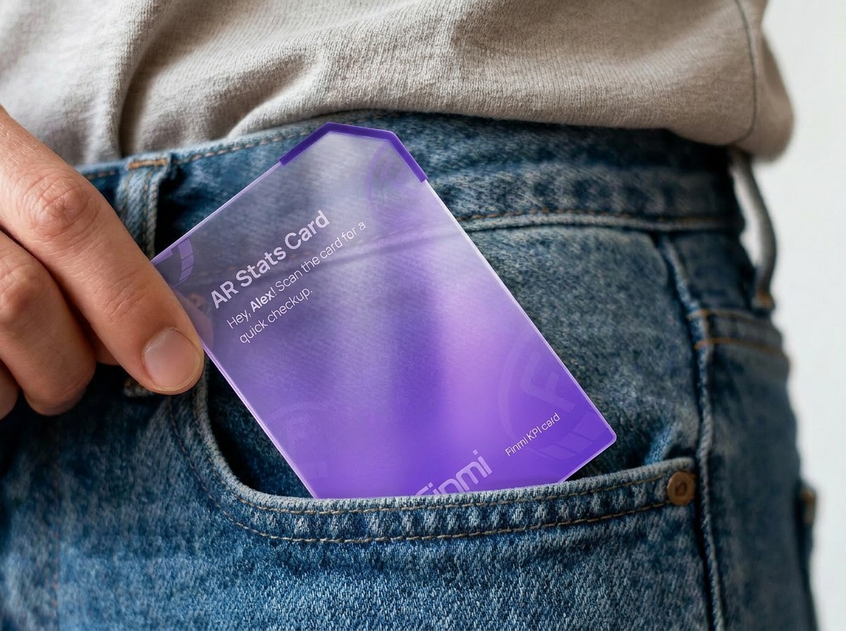
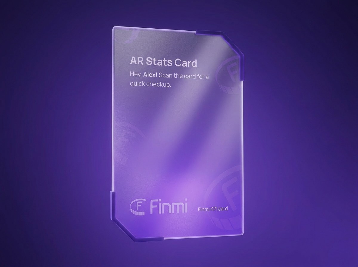
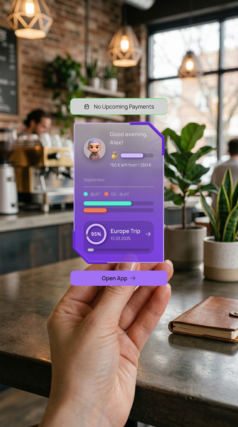
With the semi-transparent AR stats card displaying the current avatar’s KPI, the users can get a quick check by a phone scan, even without opening the app.

AR Stats Card
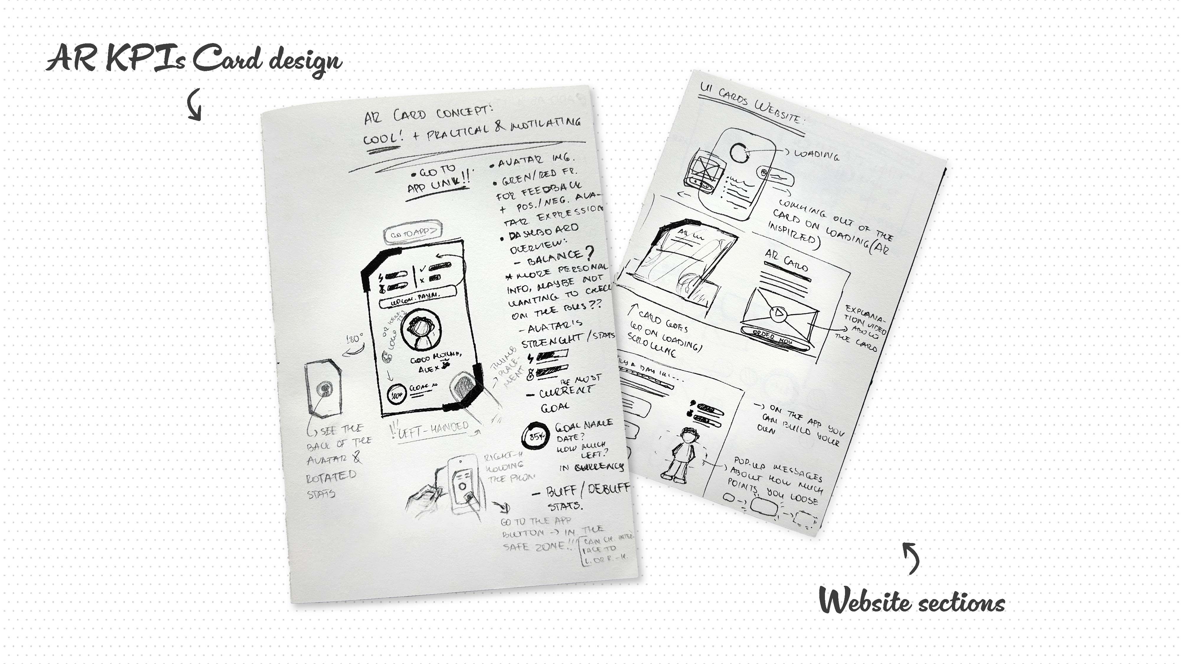
The semi-transparent background of the physical card and its irregular shape with edge cuts create a contemporary, innovative feel, visually differentiating it from the bank cards in the wallet. The interactive buttons of the VR experience are positioned in the centre, at the bottom of the screen, so that both left and right-handed users can reach them easily.
Design System
The visual style is “tech-savvy” to resonate with the target users. The rounded corners, bright colour accents, dark background, gradients and neon glows create a modern, inviting game-like feeling.
Typography
Plus Jakarta Sans font family has modern and clean forms and balanced spaces, which ensures legibility at a large range of sizes and widths. Combined with the Manrope sans-serif, they allow a strong content hierarchy- perfect for a data-heavy interface.
Plus Jakarta Sans - headings (h1 - h6)
Manrope - body copy
Colour Palette & Patterns
The square colour palette creates a vibrant and high-contrast, yet balanced look. The violet and yellow colours evoke feelings of ambition, power and introspection as well as optimism and cheerfulness. The green and red work as natural indicators of positive and negative behaviours.
The use of tints and shades of the primary and complementary colours ensures that the WCAG 2 Colour Standards are covered, allowing flexibility in the designs.
color-primary
Beyond Blue
#722bed
color-secondary-charts
Spicy Yellow
#ede42b
color-positive-behavior
Tech Teal
#2bedbe
color-negative-behavior
Intense Fiery Coral
#ed5a2b
gradient-card-red
gradient-card-green
gradient-background

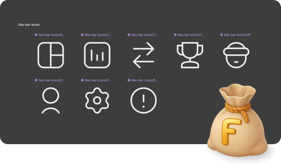
Iconography System
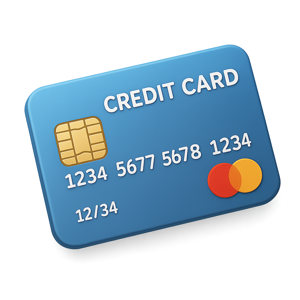
The 3D icons have a visual purpose, while the 2D icons are functional, giving context and suggesting actions without overcomplicating the interface.
To avoid restricting the use to a certain currency, the logomark is applied to all 3D icons related to money and wealth.
Component Library

Button

Button
Button


3 Upcoming Payments
Go to Calendar
CARD 1
Credit card **** 7892

Description text






Energy levels

Finance available
Full Design System in Figma

Components Design
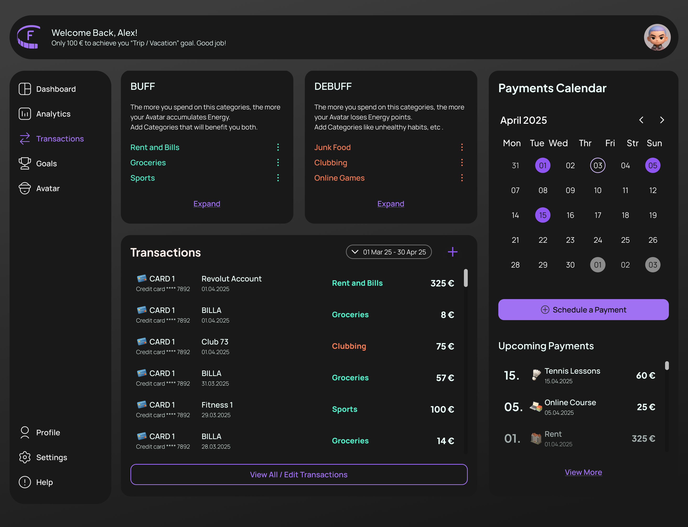
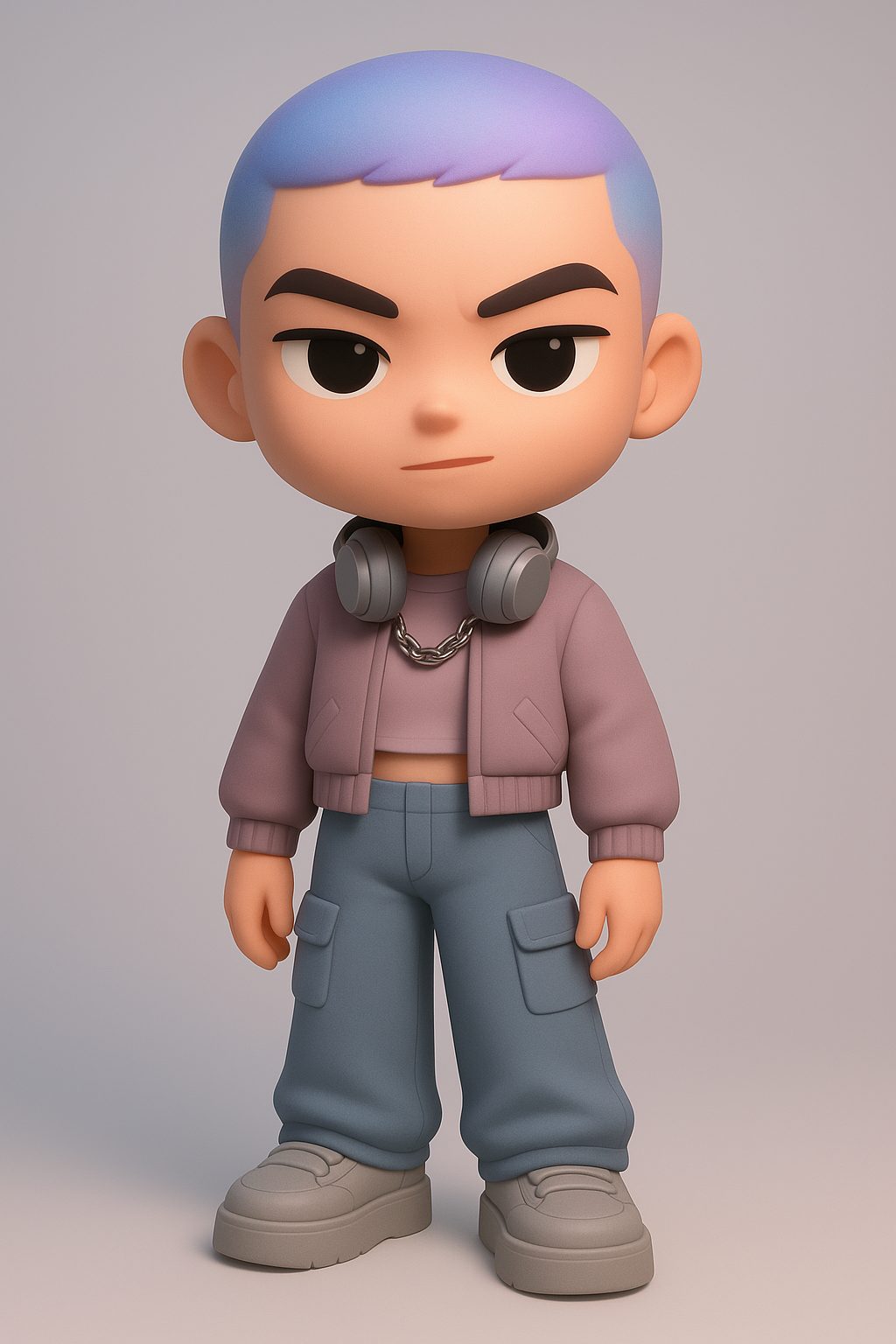
The UI components visual style is a combination of financial and crypto apps, habit trackers and online games interface design.
Alex
Energy levels

Finance available
Check on Alex
Goals Map


95%
Europe Trip/Vacation
15.05.2025

25%
Car
01.09.2025
New Camera
20.04.2025
25%
B-days
30.06.2025

75%
Review Goals

Customisable avatars and avatar stats.
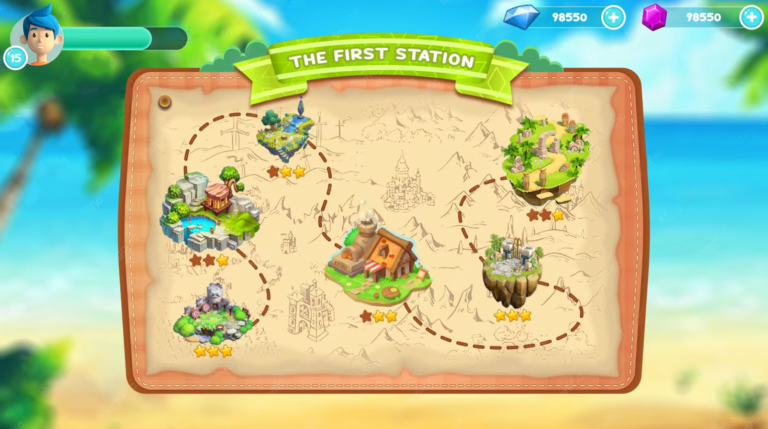

Game level select screen with a dashed line path connecting the levels.


Income


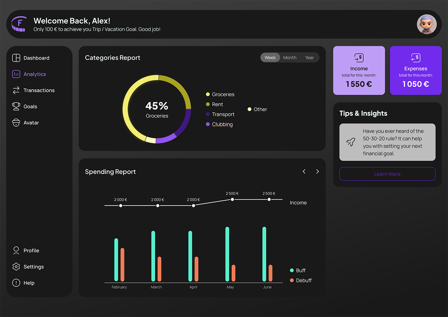
Progress charts with neon glow and sans-serif fonts.
Responsive &
Interaction Design
Emotional Feedback & Animations
The micro-interactions and state changes reinforce the positive actions and provide immediate feedback. This approach ensures that the abstract financial data is presented in an understandable and ‘human’ way.
Example: A “Progress” type button serves as a visual cue for what steps of the process have been completed.
Responsiveness

0 - 400px
4 column grid

400 - 1000px
8 column grid

> 1000px
12 column grid
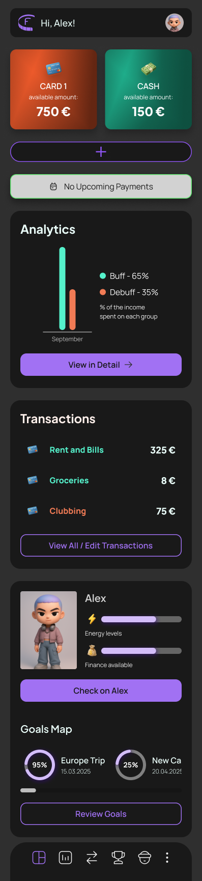
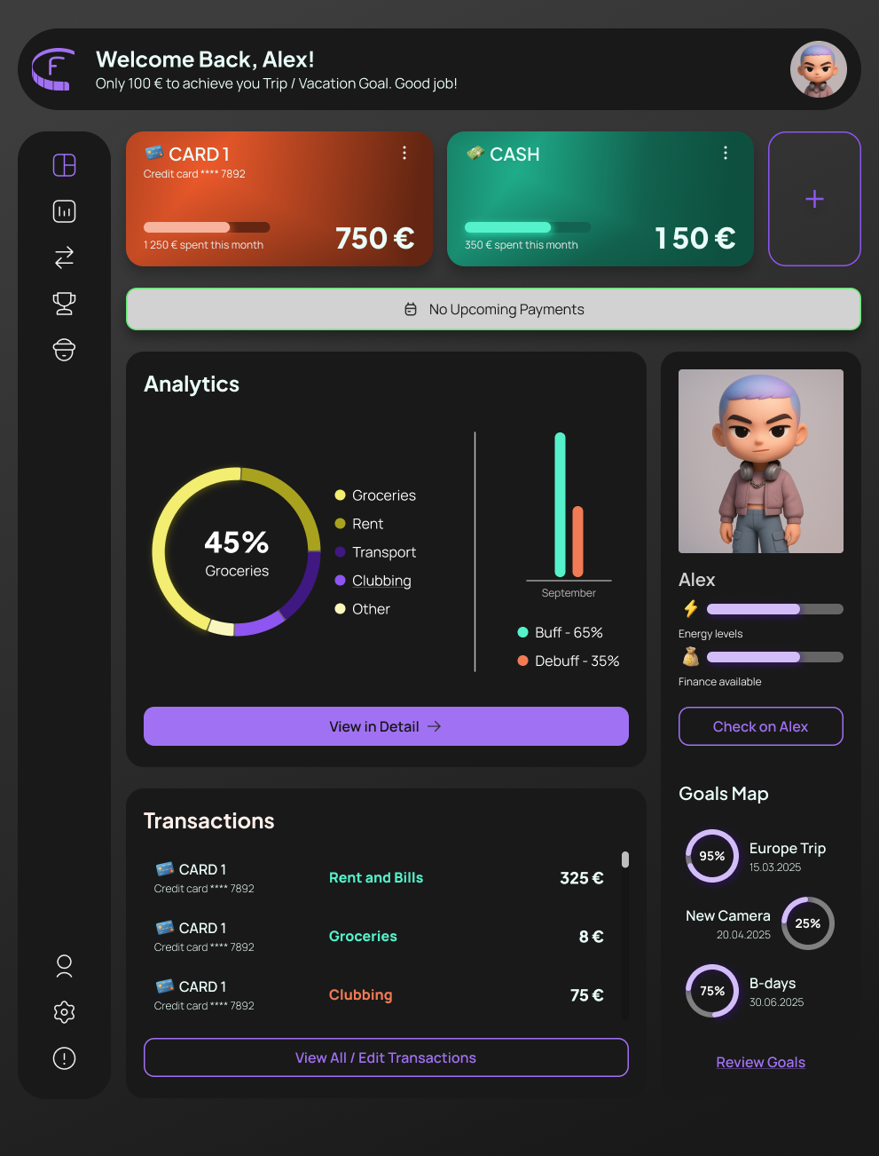
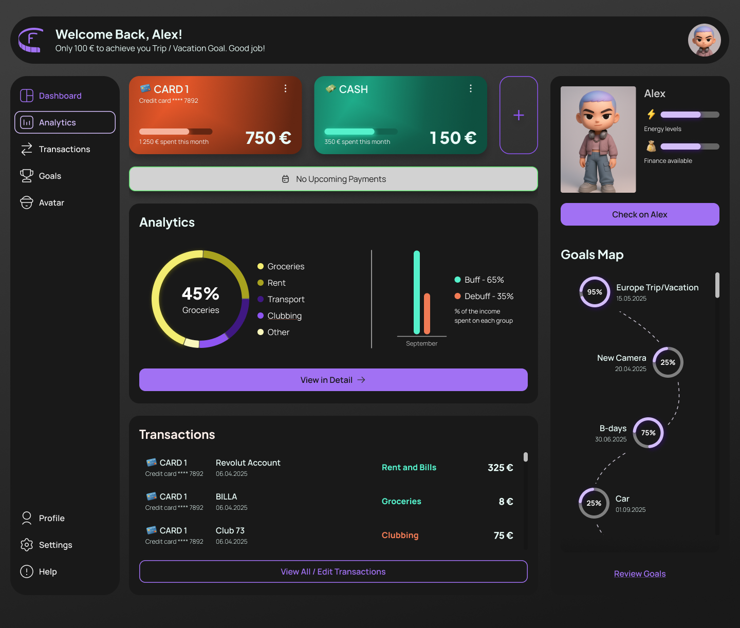
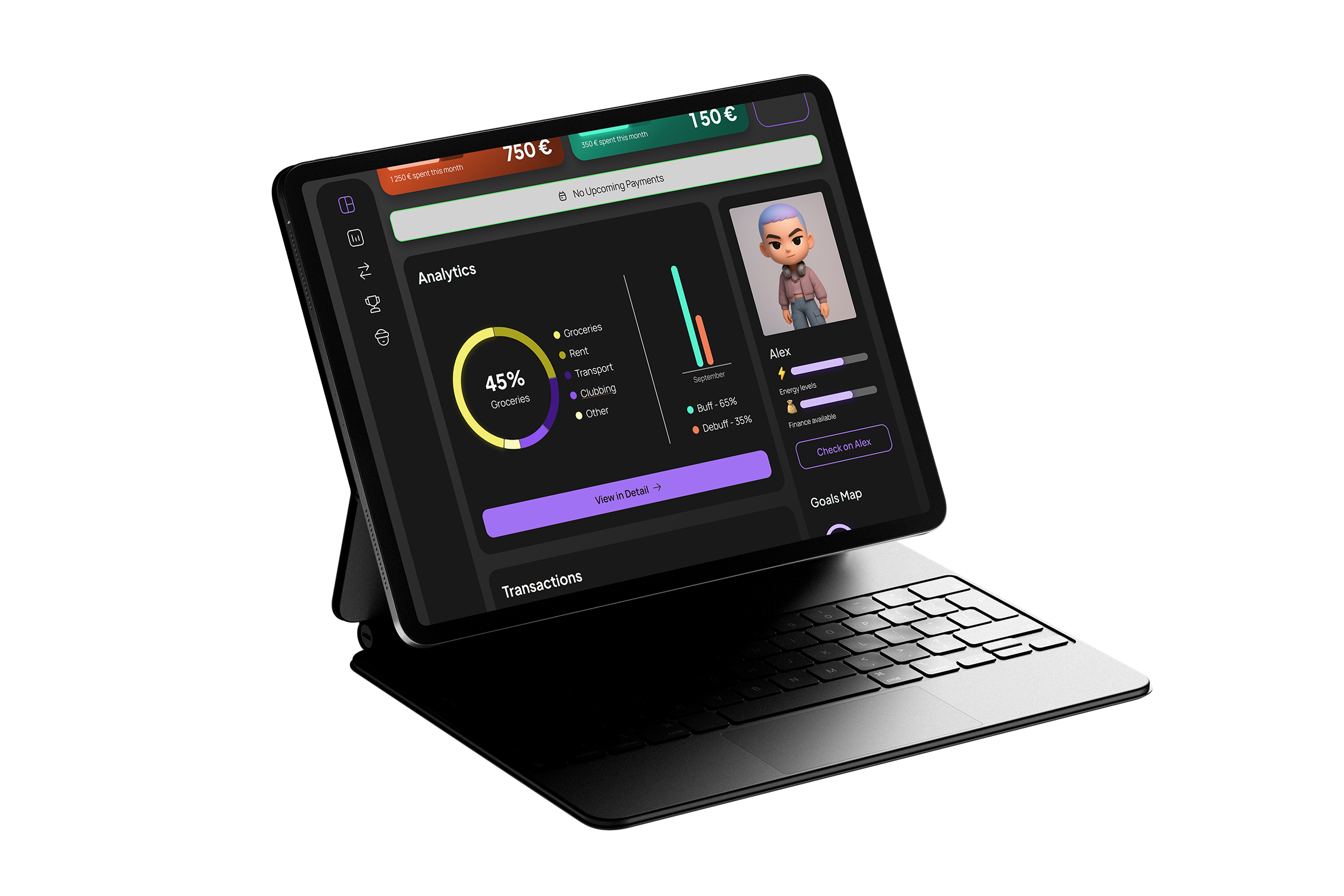
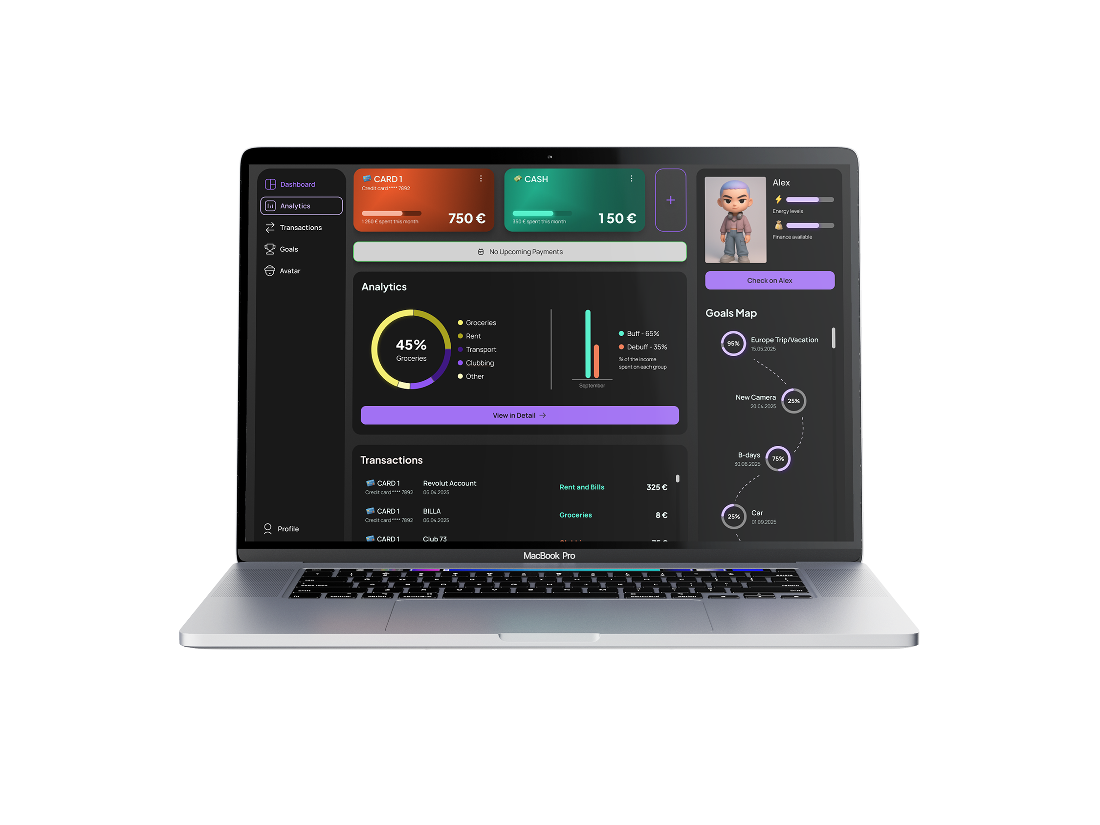
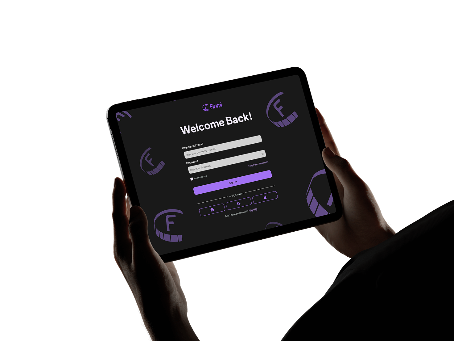
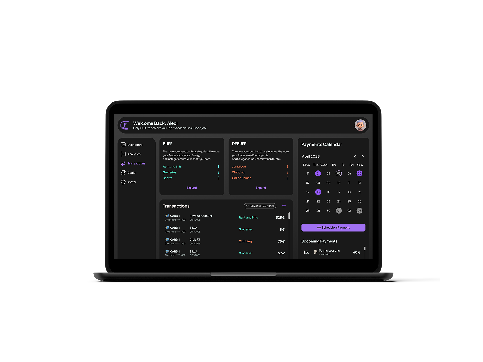
Final Screens
Results
I delivered a working design system from scratch and scaled it to a full brand. The assets and the design rules have been applied to both digital and physical products.
The web-based app was my final project for the UI Design System SoftUni course, for which I received the highest score.


next case study
back to homepage
Katerina Kirilova
kreationkeen@gmail.com


portfolio homepage
kreationkeen@gmail.com
Finmi Case Study
portfolio
about
ux/ui design
Design System
Visual Identity
digital Product Design
Responsive web design
Results & Deliverables
- A functional design system that can be applied across physical and digital products.
finmi
Finmi is a web-based finance tracker that fills the gap between boring budgeting dashboards and over-gamified habit apps. The app’s mission is to empower young adults to take control of their spending through clear visual feedback and positive reinforcement.
I created a scalable design system with interactive UI components and high-fidelity prototypes of the app in Figma. The assets have been later applied across all brand products.
The Problem
The idea for this digital product came to me after listening to my peers always complain about not having any money left toward the end of the month. Therefore, I decided to create a digital product that shows visually how small daily habits affect personal finances.
Target Users
- University students and recent graduates (18–28 years old).
- Young adults with limited financial literacy or irregular income.
- Ambitious users who enjoy personalized, visual, and interactive digital tools.
Research
The majority of the finance apps’ dashboards consist of graphs, charts, and tables predominantly, while some habit trackers have too gamified user interfaces, not built for clear financial data display. Therefore, I combined simply designed infographics with a colour-based feedback system, literal 3D icons, and customizable avatars to ensure clear visual feedback and achieve an inviting and easy-to-navigate interface for the target users.

Sketching out simple charts and UI components.
Brand Design Strategy
The product brand concept was developed around combining the digital with the real world, giving immediate feedback on spending. It was important to make the use of the app a no-brainer, to blend it into the daily life.
Therefore, I created a semi-transparent AR stats card that displays the current avatar’s KPI. In this way, the users can get a quick check by a phone scan, even without opening the app.

AR Stats Card
The semi-transparent background of the physical card and its irregular shape with edge cuts create a contemporary, innovative feel, visually differentiating it from the bank cards in the wallet. The interactive buttons of the VR experience are positioned in the centre, at the bottom of the screen, so that both left and right-handed users can reach them easily.
Design System
The visual style is “tech-savvy” to resonate with the target users. The rounded corners, bright colour accents, dark background, gradients and neon glows create a modern, inviting game-like feeling.
Typography
Plus Jakarta Sans font family has modern and clean forms and balanced spaces, which ensures legibility at a large range of sizes and widths. Combined with the Manrope sans-serif, they allow a strong content hierarchy- perfect for a data-heavy interface.
Plus Jakarta Sans - headings (h1 - h6)
Manrope - body copy
Colour Palette & Patterns
The square colour palette creates a vibrant and high-contrast, yet balanced look. The violet and yellow colours evoke feelings of ambition, power and introspection as well as optimism and cheerfulness. The green and red work as natural indicators of positive and negative behaviours.
The use of tints and shades of the primary and complementary colours ensures that the WCAG 2 Colour Standards are covered, allowing flexibility in the designs.
color-primary
Beyond Blue
#722bed
color-secondary-charts
Spicy Yellow
#ede42b
color-positive-behavior
Tech Teal
#2bedbe
color-negative-behavior
Intense Fiery Coral
#ed5a2b
gradient-card-red
gradient-card-green
gradient-background

Iconography System
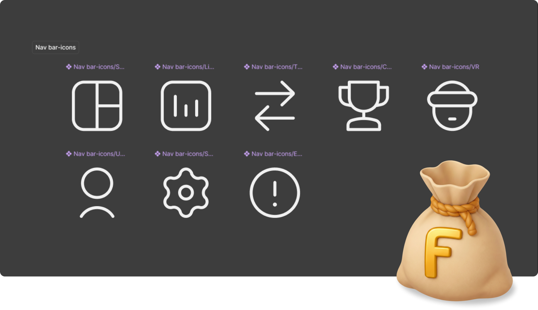
The 3D icons have a visual purpose, while the 2D icons are functional, giving context and suggesting actions without overcomplicating the interface.
To avoid restricting the use to a certain currency, the logomark is applied to all 3D icons related to money and wealth.
Component Library
Button
Button
Button
3 Upcoming Payments
Go to Calendar
CARD 1
Credit card **** 7892
Description text
1 550 €

September
Energy levels
Finance available
Full Design System in Figma

Components Design
The UI components visual style is a combination of financial and crypto apps, habit trackers and online games interface design.
Alex
Energy levels
Finance available
Check on Alex
Goals Map
95%
Europe Trip/Vacation
15.05.2025
25%
Car
01.09.2025
New Camera
20.04.2025
25%
B-days
30.06.2025
75%
Review Goals

Customisable avatars and avatar stats.
Game level select screen with a dashed line path connecting the levels.
Income

Progress charts with neon glow and sans-serif fonts.
Responsive &
Interaction Design
Emotional Feedback & Animations
The micro-interactions and state changes reinforce the positive actions and provide immediate feedback. This approach ensures that the abstract financial data is presented in an understandable and ‘human’ way.
Example: A “Progress” type button serves as a visual cue for what steps of the process have been completed.
Responsiveness

- 0 - 400px
- 4 column layout grid

- 400 - 1000px
- 8 column layout grid

- > 1000px
- 12 column layout grid
Final Screens
Results
I delivered a working design system from scratch and scaled it to a full brand. The assets and the design rules have been applied to both digital and physical products.
The web-based app was my final project for the UI Design System SoftUni course, for which I received the highest score.


back to homepage
next case study
Katerina Kirilova
kreationkeen@gmail.com