Print.bg Case Study
portfolio
about
Brand system
Marketing Campaigns
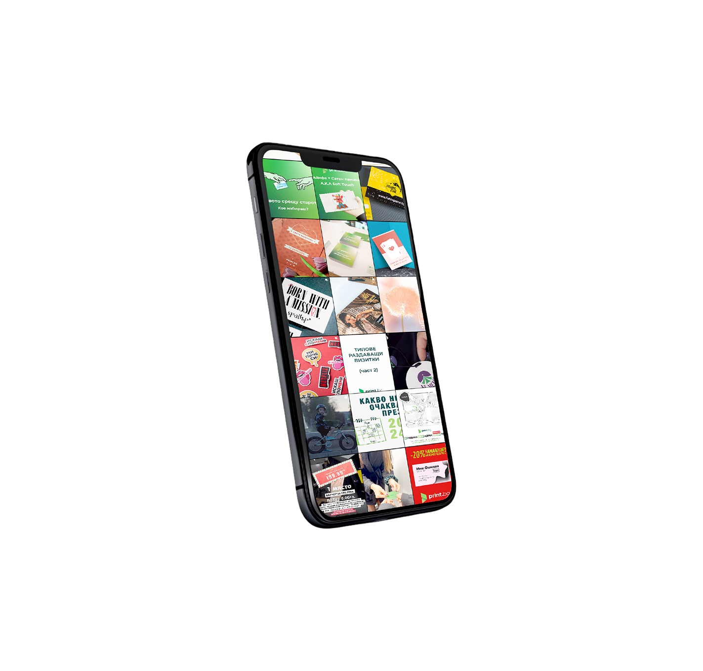
Social Media visuals
event Design
Motion Graphics
Results & Deliverables
- A brand awareness campaign that has led to new partnerships.
- Templates for in-house and marketing purposes, being still in use more than a year later.
print.bg
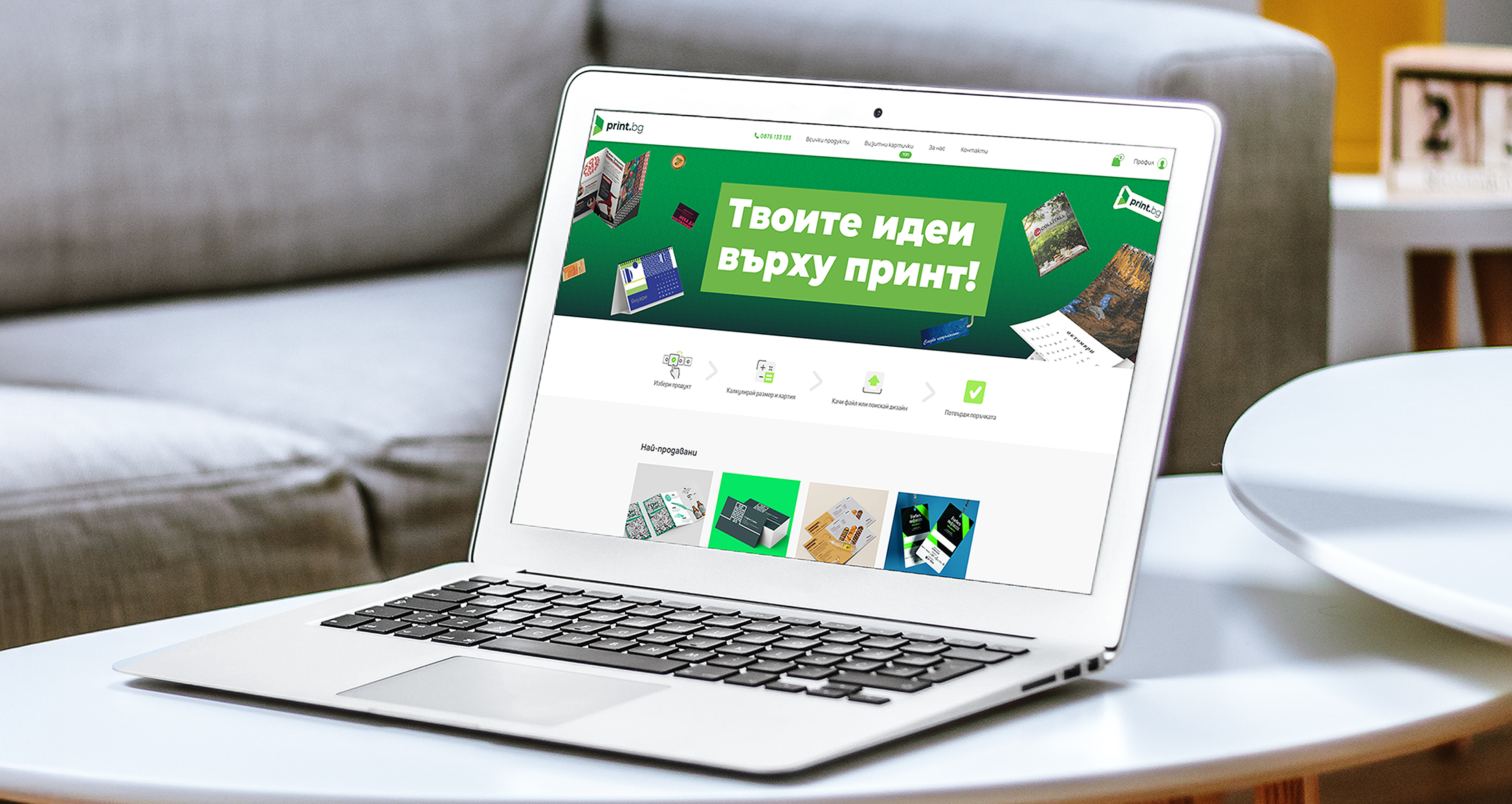
Print.bg is an online printing portal focused on optimising the printing process for small businesses and creatives. When I joined their team as a Graphic Designer, they had just started a brand refresh. I took a lead role in the development of their brand system and the design of visuals for the monthly marketing campaigns, social media and partners’ events.
The Challenge
The main goal of the company was to pivot away from a strictly professional look and develop a visual system that better communicates the company’s values- innovation, creativity, versatility and human connections.
I had taken the initiative to interview target clients (young creatives and small business owners) and find out how they perceive the brand. Also, getting to know the company’s work process, I came across the following pain points:

There is no clear direction or narrative that clients and potential partners can remember or identify with.
The current brand system is not flexible or scalable enough, resulting in visual inconsistency across channels.
The Print.bg team finds it difficult to handle client work while developing a brand image and often relies on freelance designers and external agencies, which increases the company's spending.
Solution & Deliverables
Working closely with the Marketing and Sales teams, we focused on creating assets and campaign visuals that would lead to consistent storytelling across channels, speed up the design process and clearly position the company as an innovative and accessible solution for anyone needing printing services.
As the majority of printing studios are product-focused, leaning into a more subtle, clean, and corporate look, we decided to put the human experience in focus and go for a bold, creative, and dynamic visual style. We balanced the brand between professionalism and whimsicality.

Brand System
Typography
Bold uppercase sans-serif typography with central alignment supports strong messaging and grabs attention. The hand-drawn font reminds of ink marks on paper and adds creative flavour.
headings & body copy
Montserrat Black
Montserrat Regular
secondary typeface
Caveat
Colours & Patterns
I expanded the brand library with pre-defined gradients and hand-drawn textures and elements to communicate energy, approachability and versatility.
Young Green
#95CA5C
Lime Green
#72B534
Naughty Green
#00913A
Earth Green
#1C5C41


Compositions & Layouts
Asymmetrical and dynamic layouts introduce motion and help avoid too rigid corporate patterns.
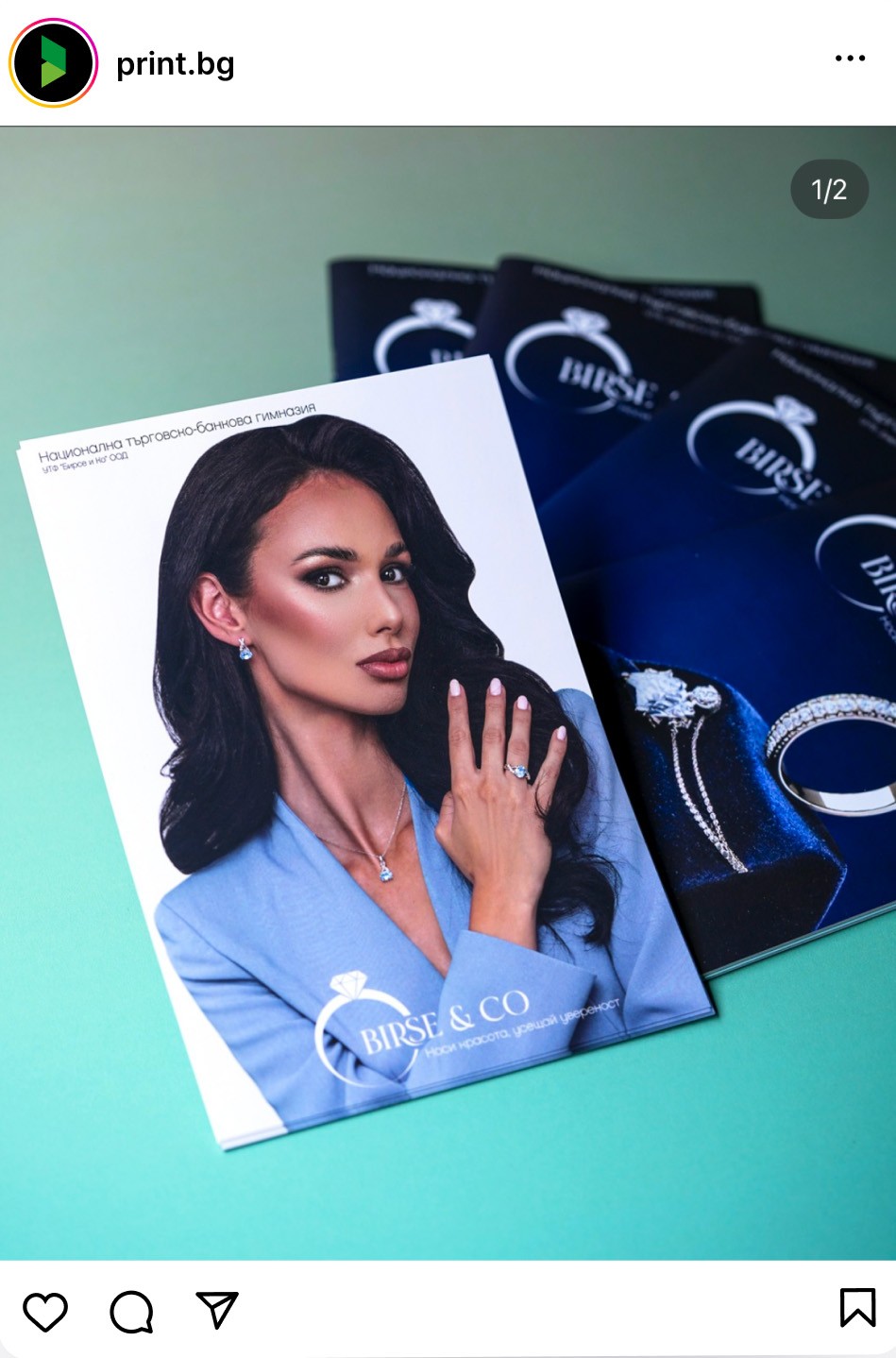
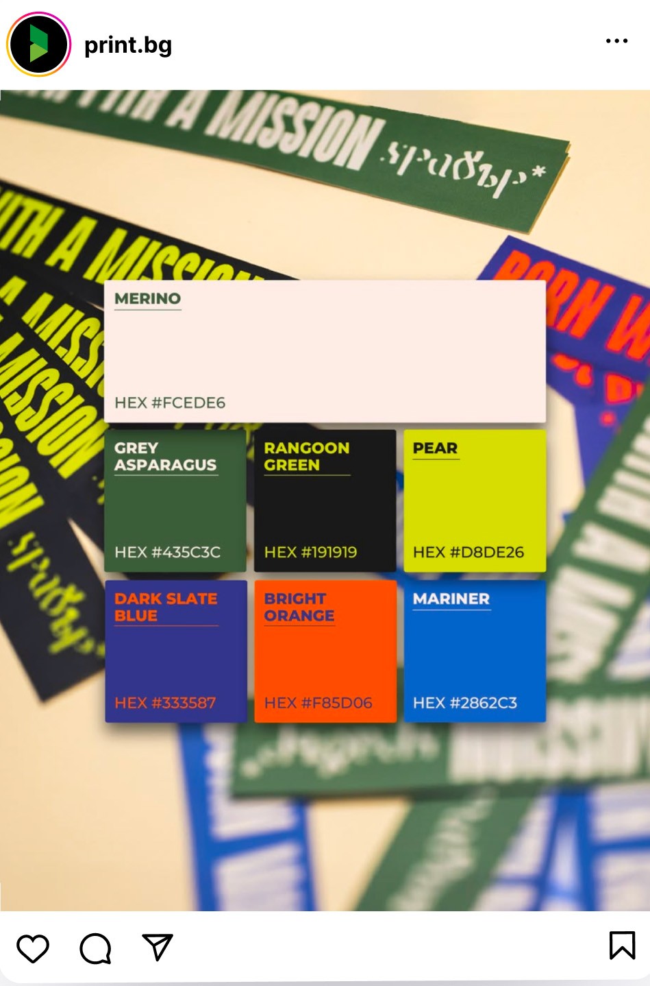
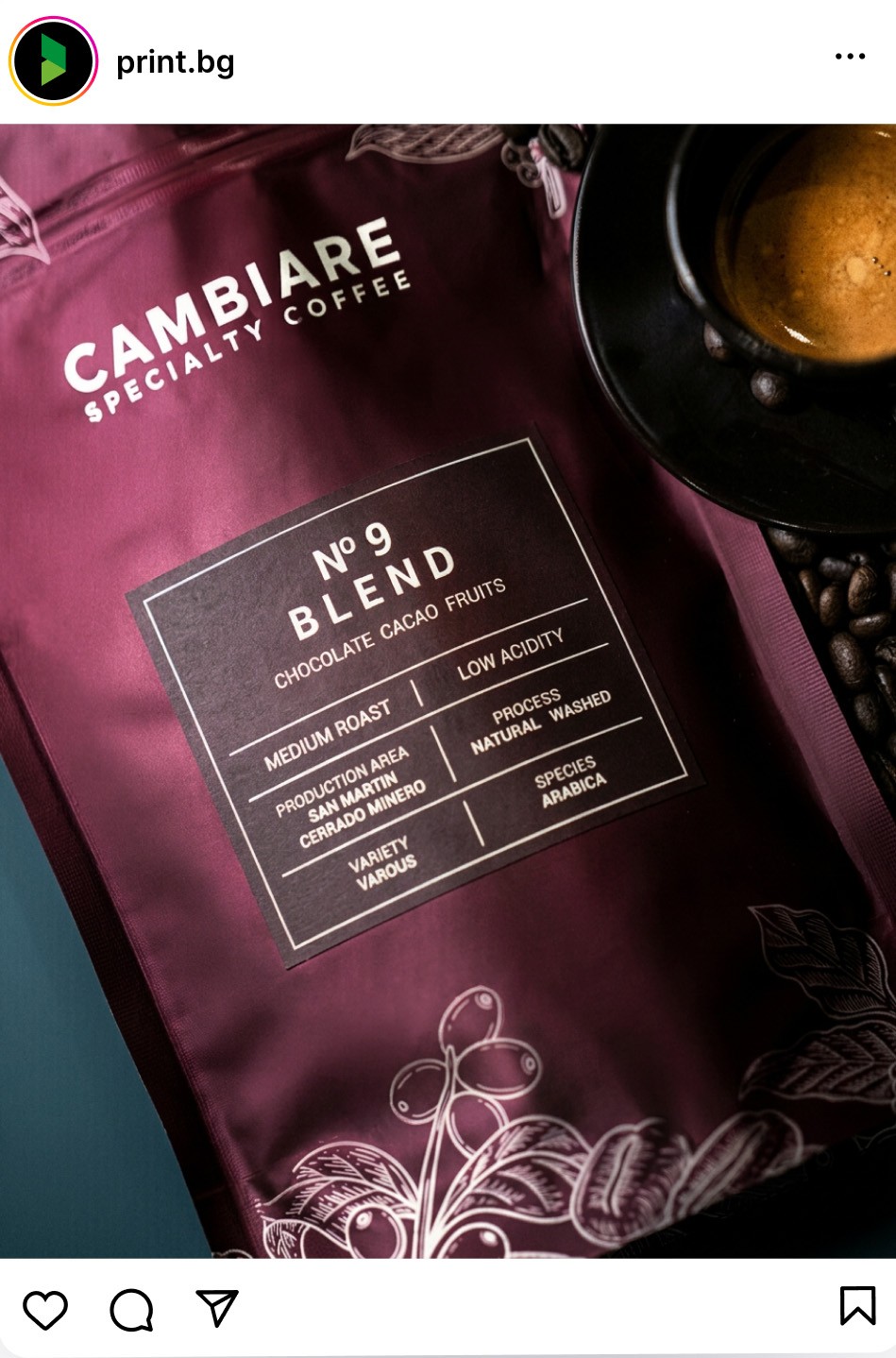
Brand Photography & Mockups:
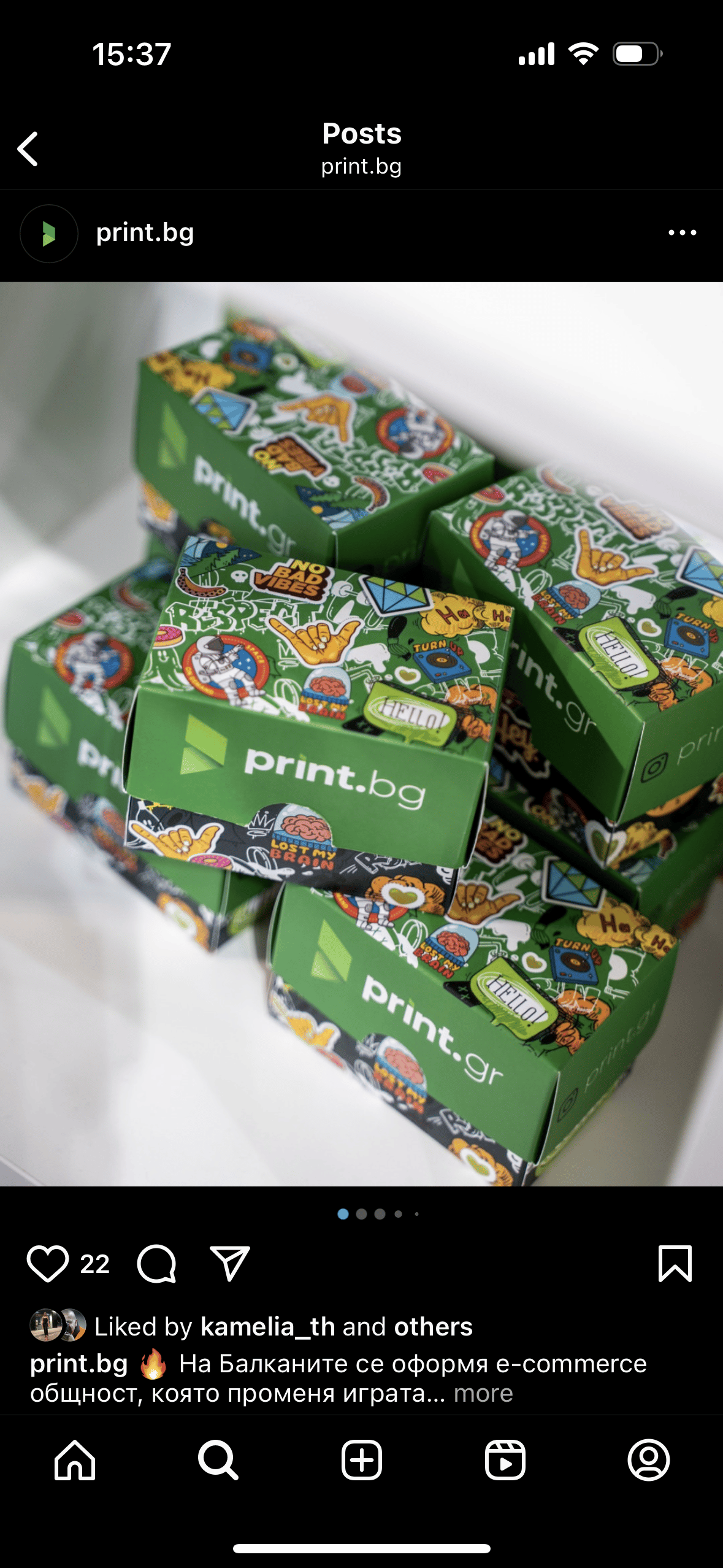
Professional product photography and mockups showcase the quality and versatility of the printed materials, while capturing the clients’ stories.
Deliverables
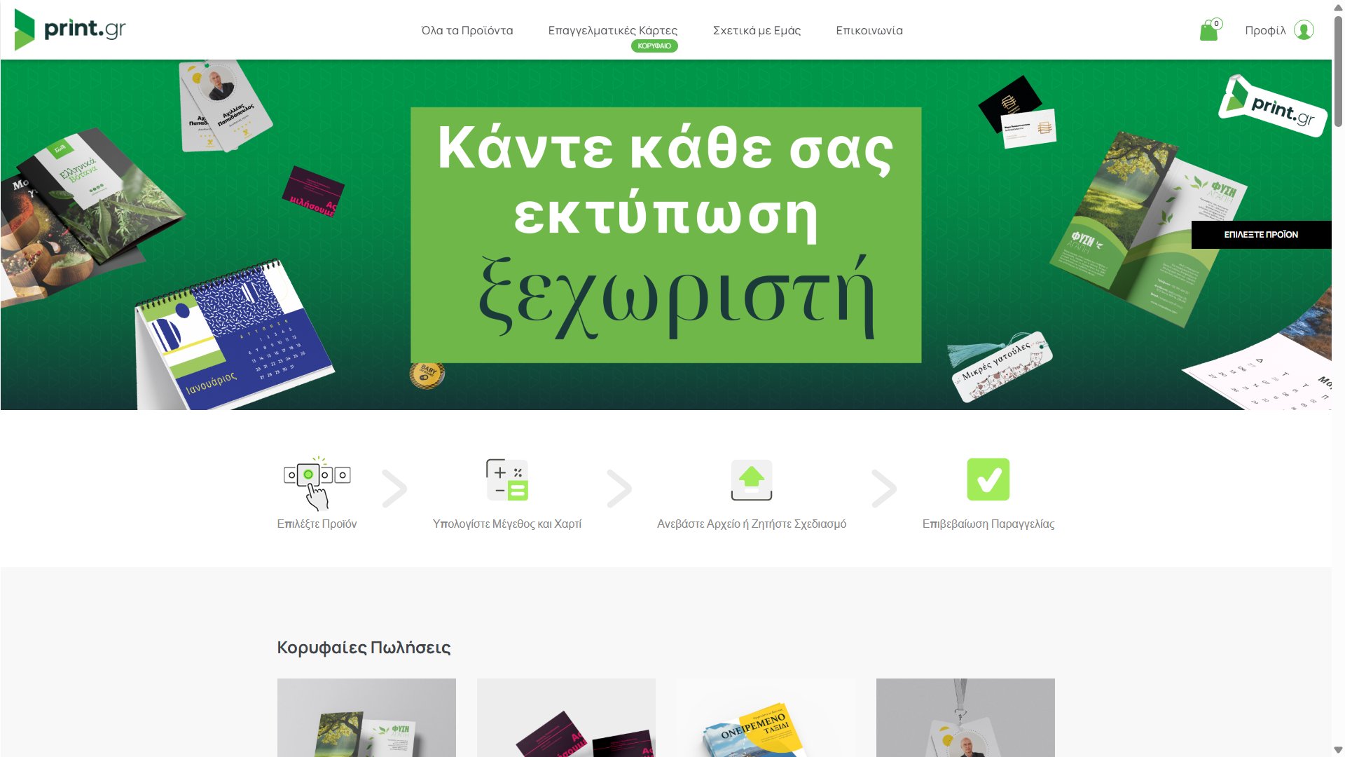
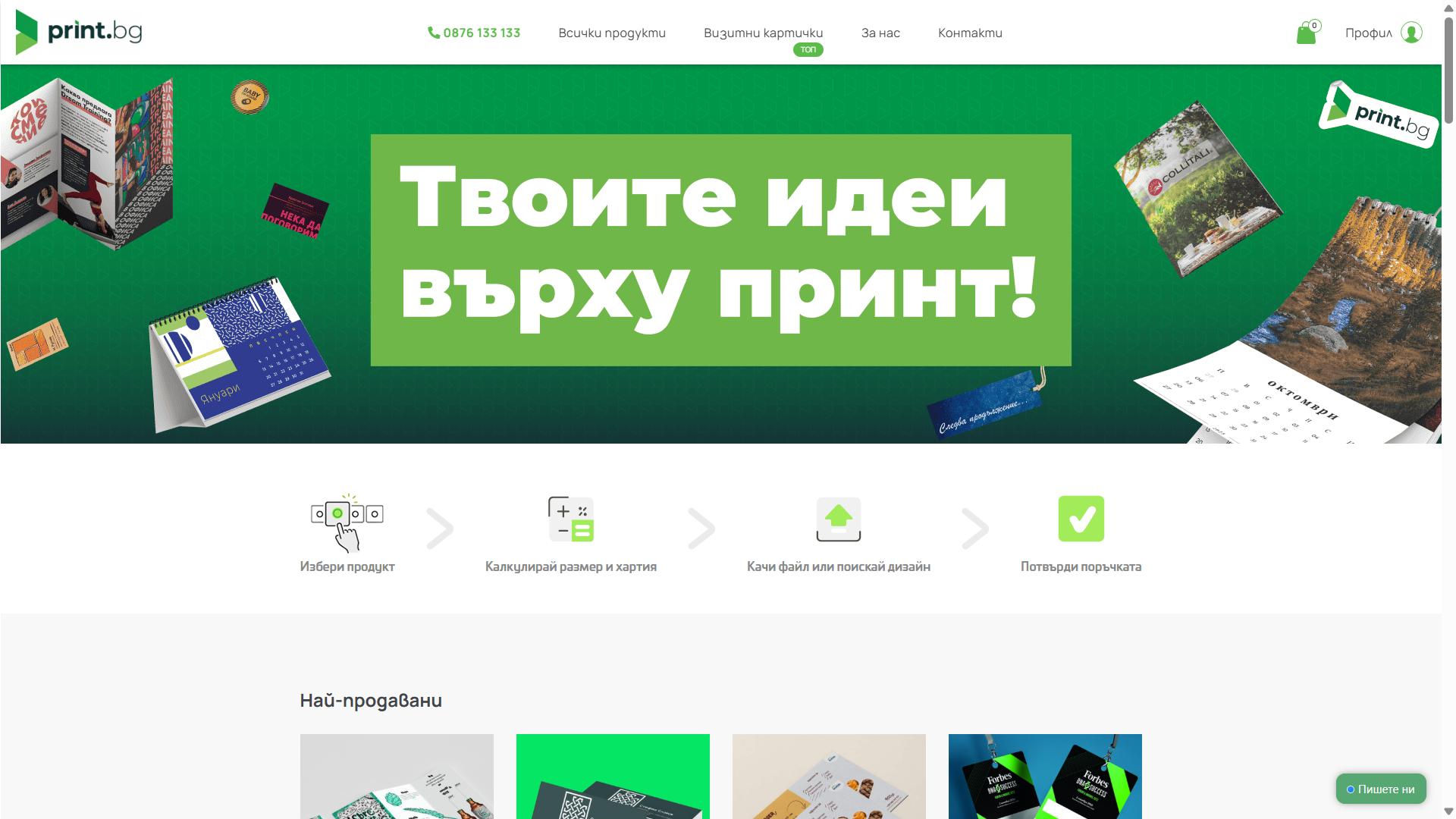
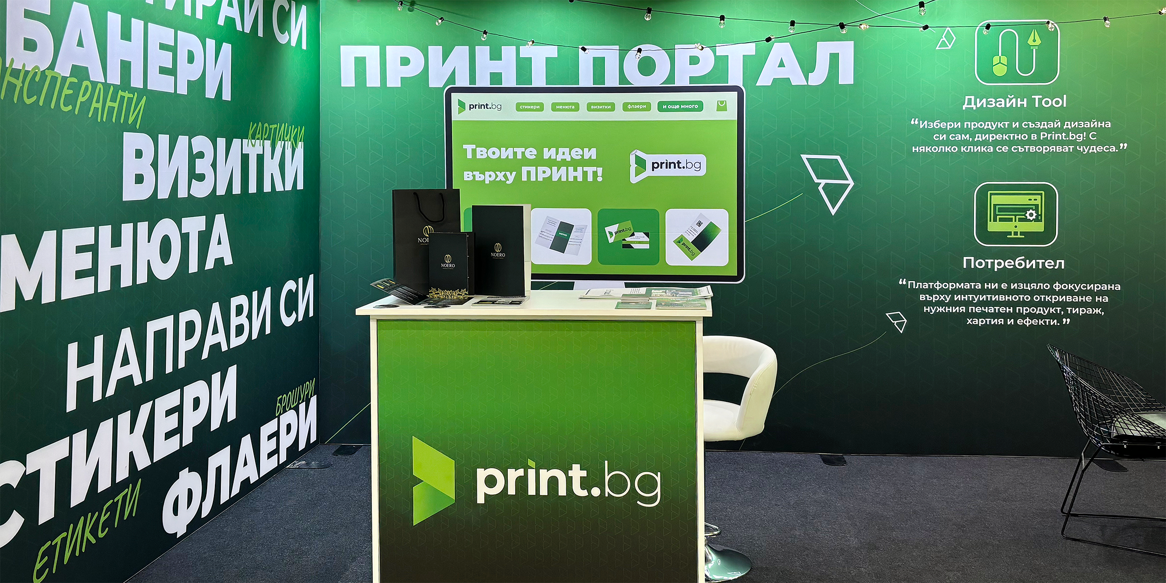
All of the web and marketing visuals, and mockups have been adapted for the Greek market when the company expanded. The developed brand system and templates allowed us to do it all in-house, with very little help from an external agency.
Events & Print Design
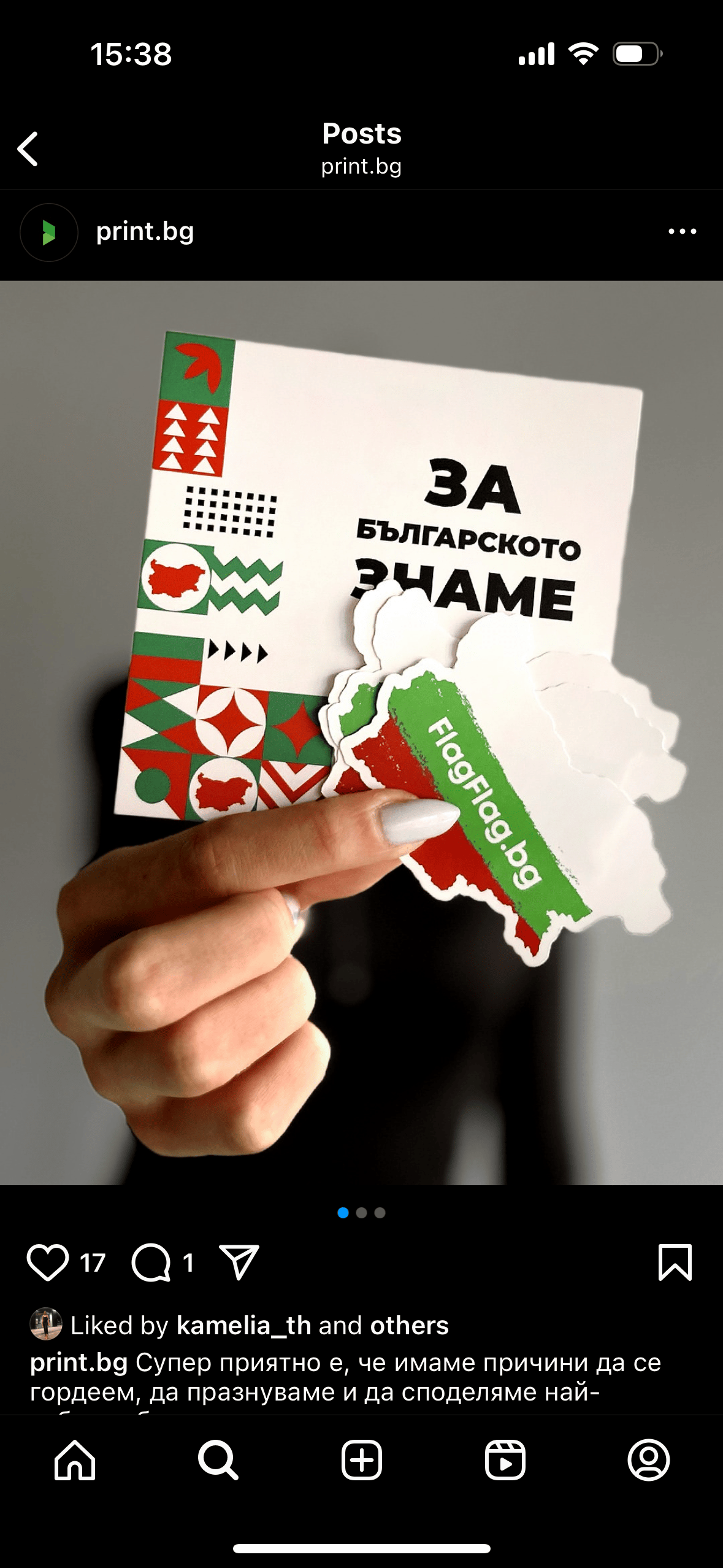
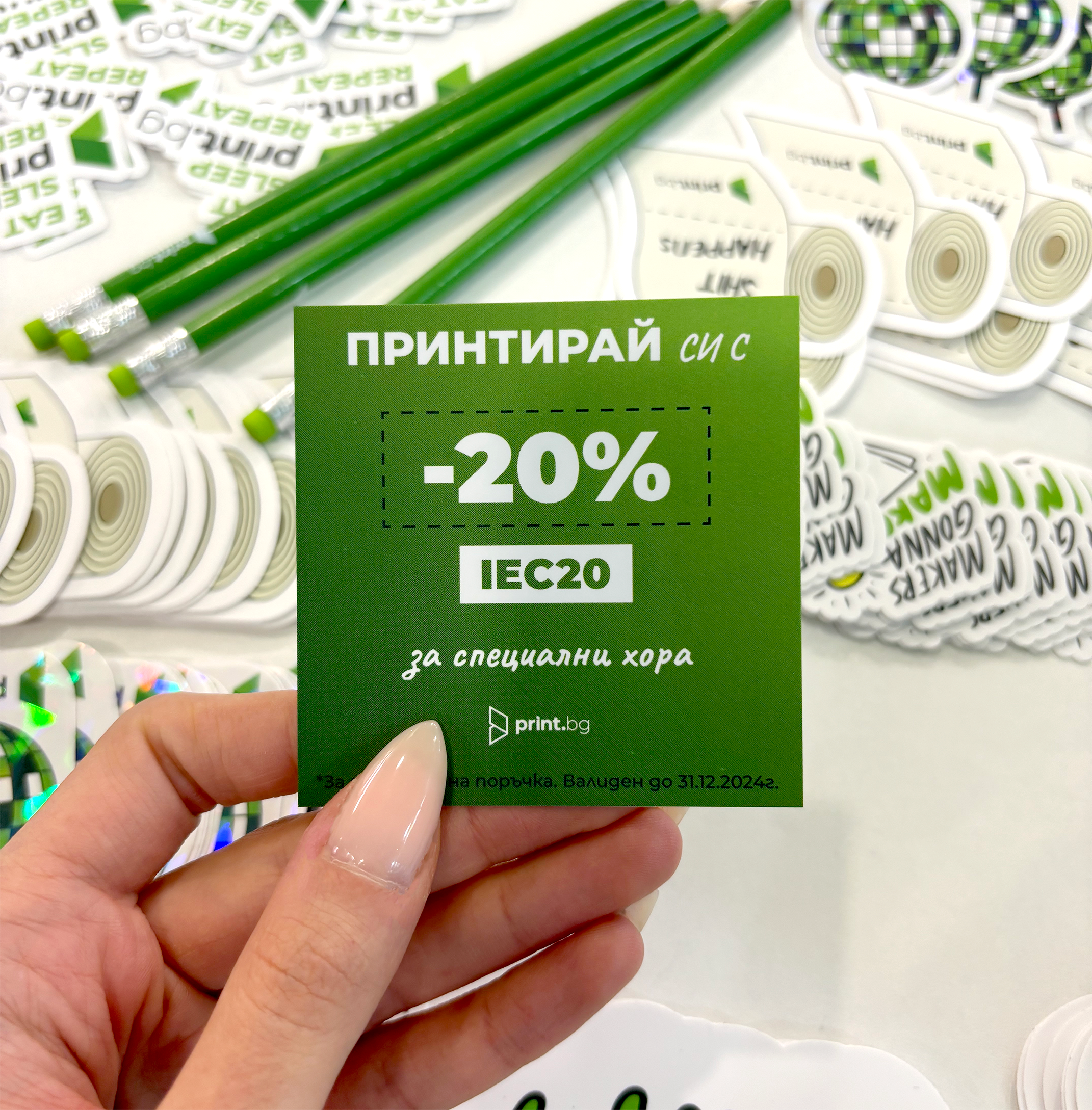
We thought in detail about the full customer journey, placing Easter eggs such as witty messages and discount codes on all brand materials. This has led to long-term partnerships and client connections by leaving positive feelings after brand interactions.
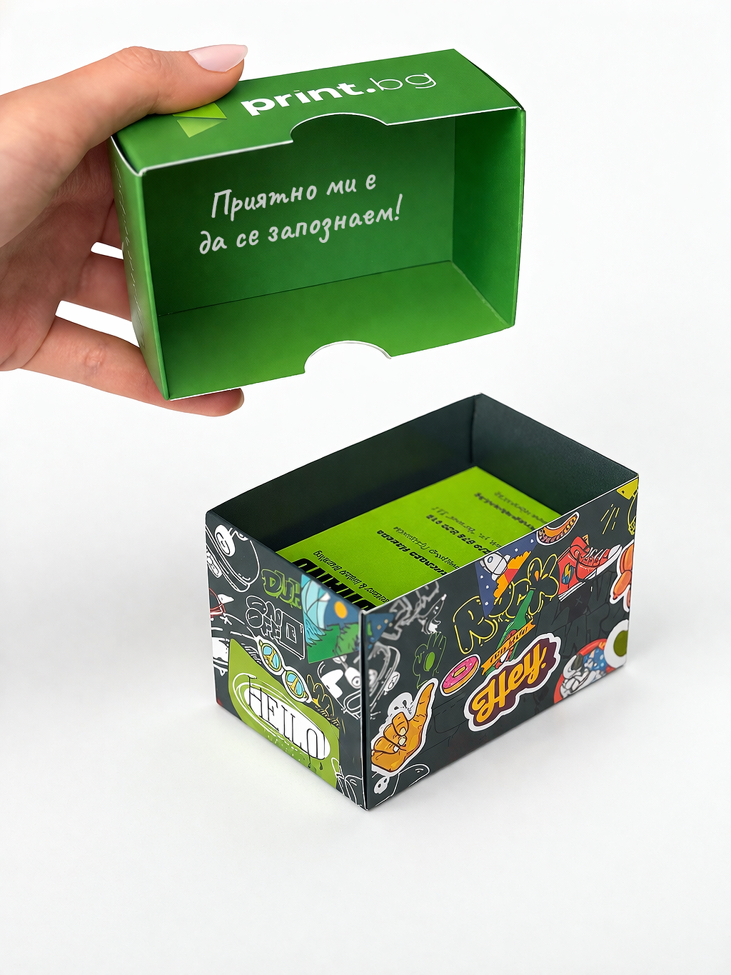
“Nice to meet you!” message inside the branded business cards boxes.
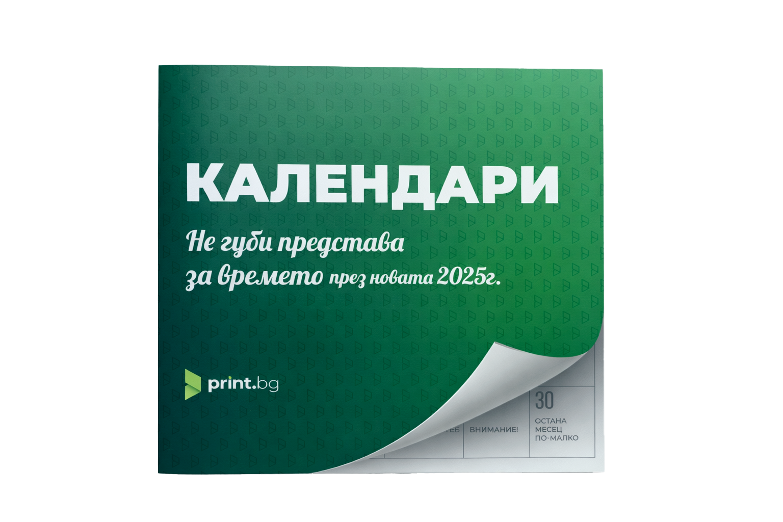
Branded calendar catalogue cover with the illusion of a lifted page, revealing a piece of calendar sheet with “One month down” written under the last day of the month.


Brand Awareness Campaign Video
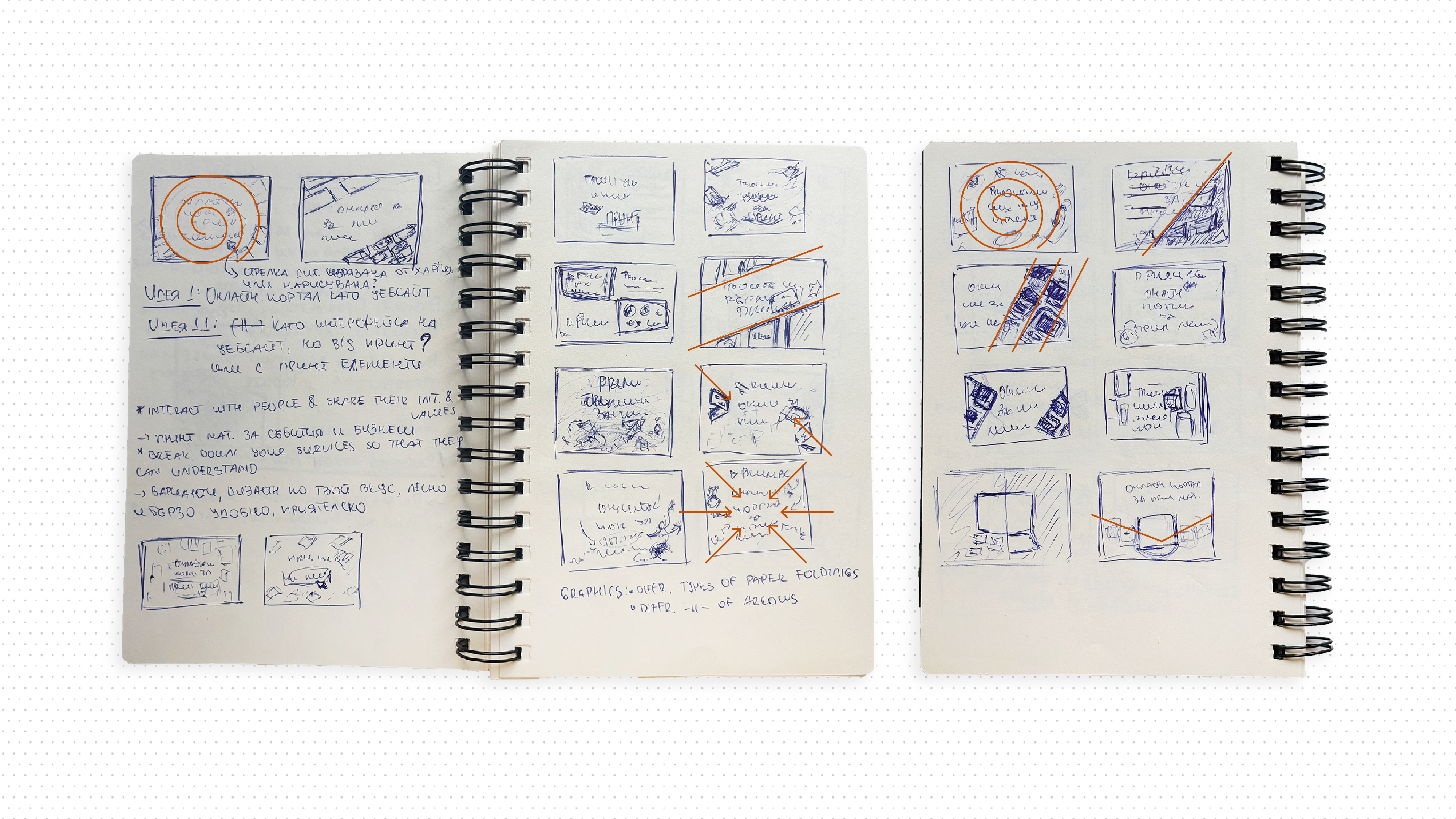
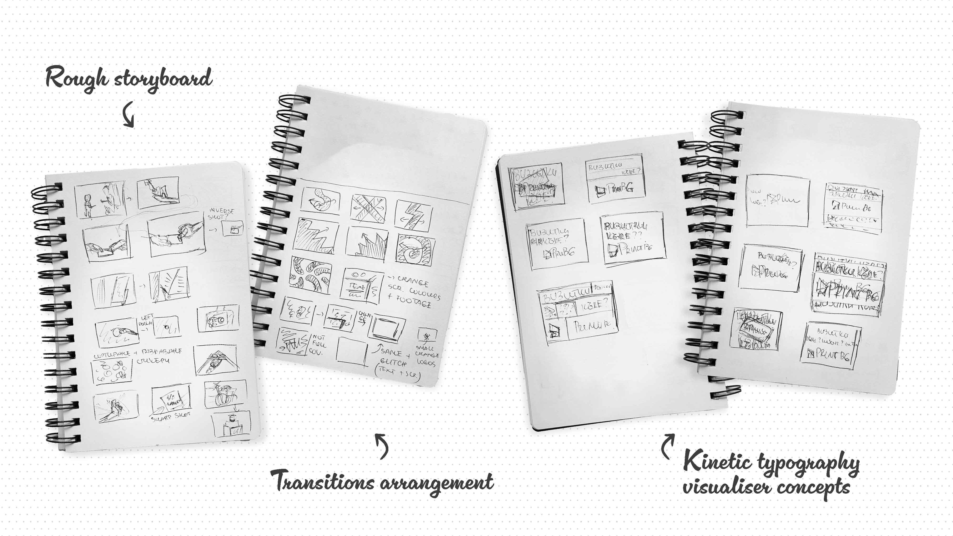
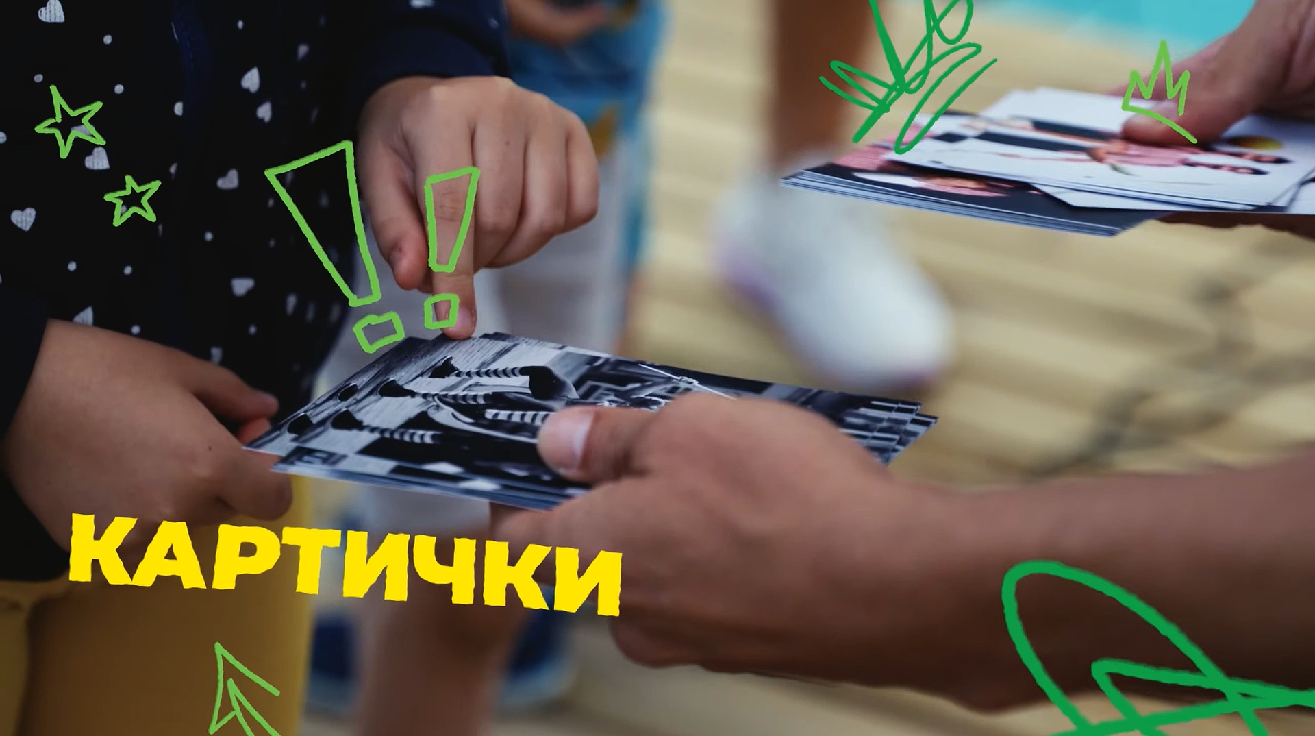
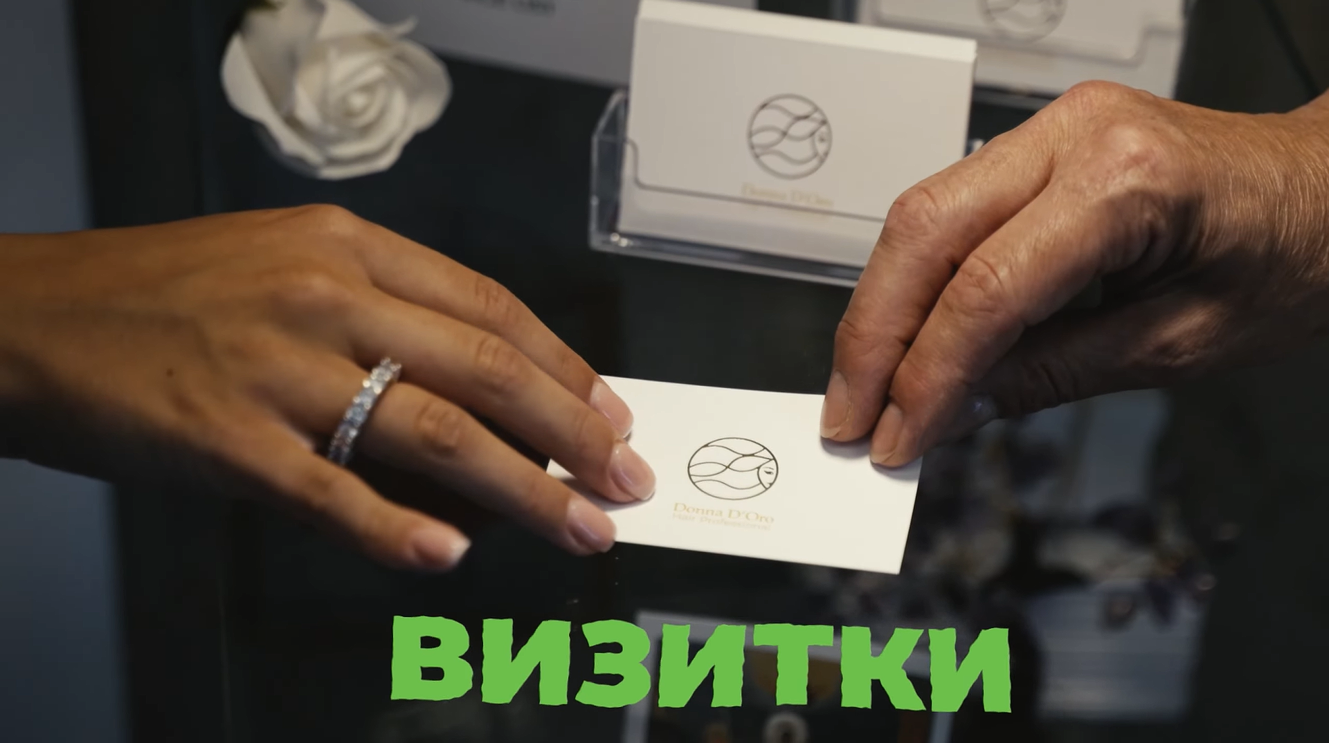
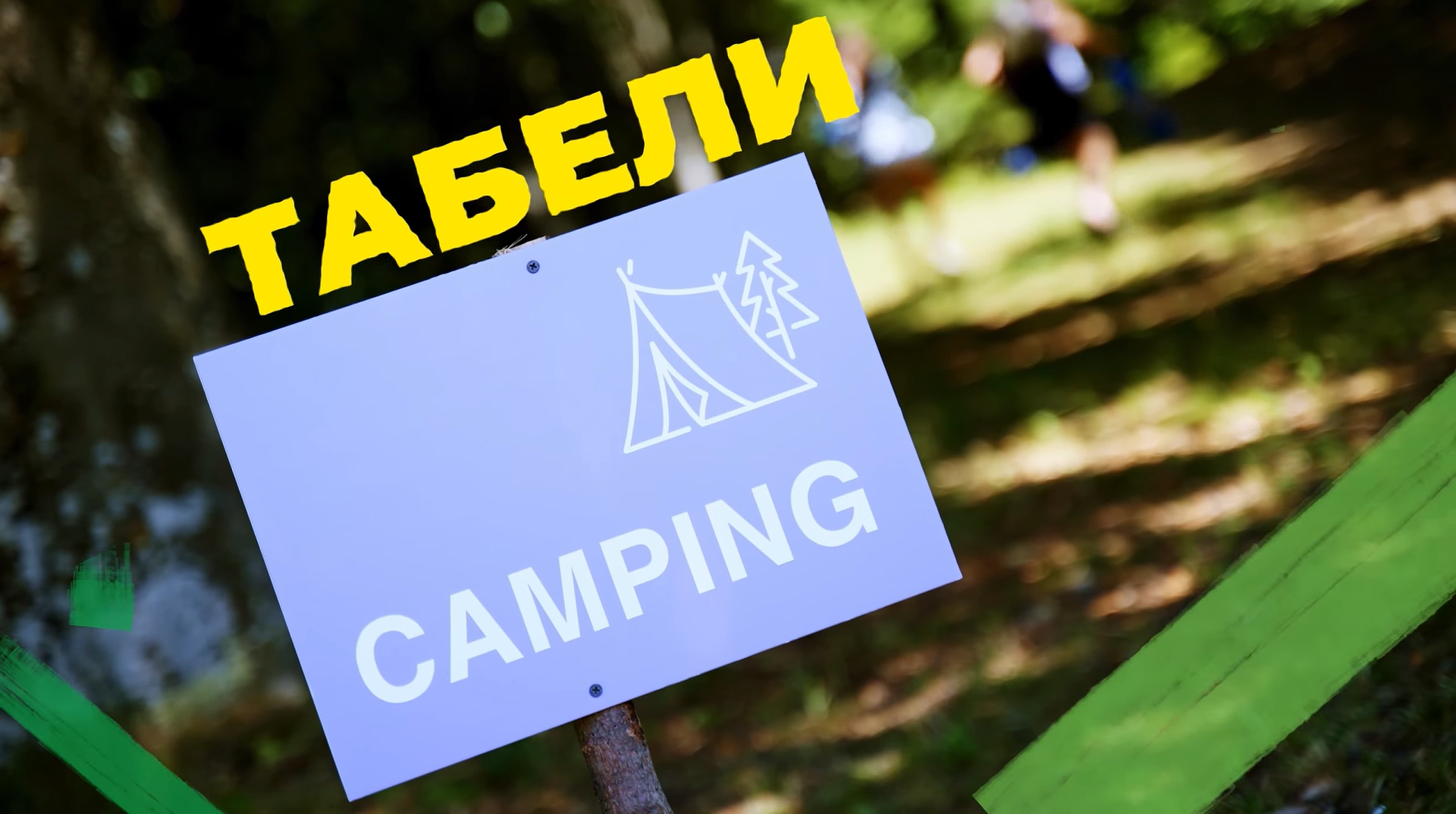
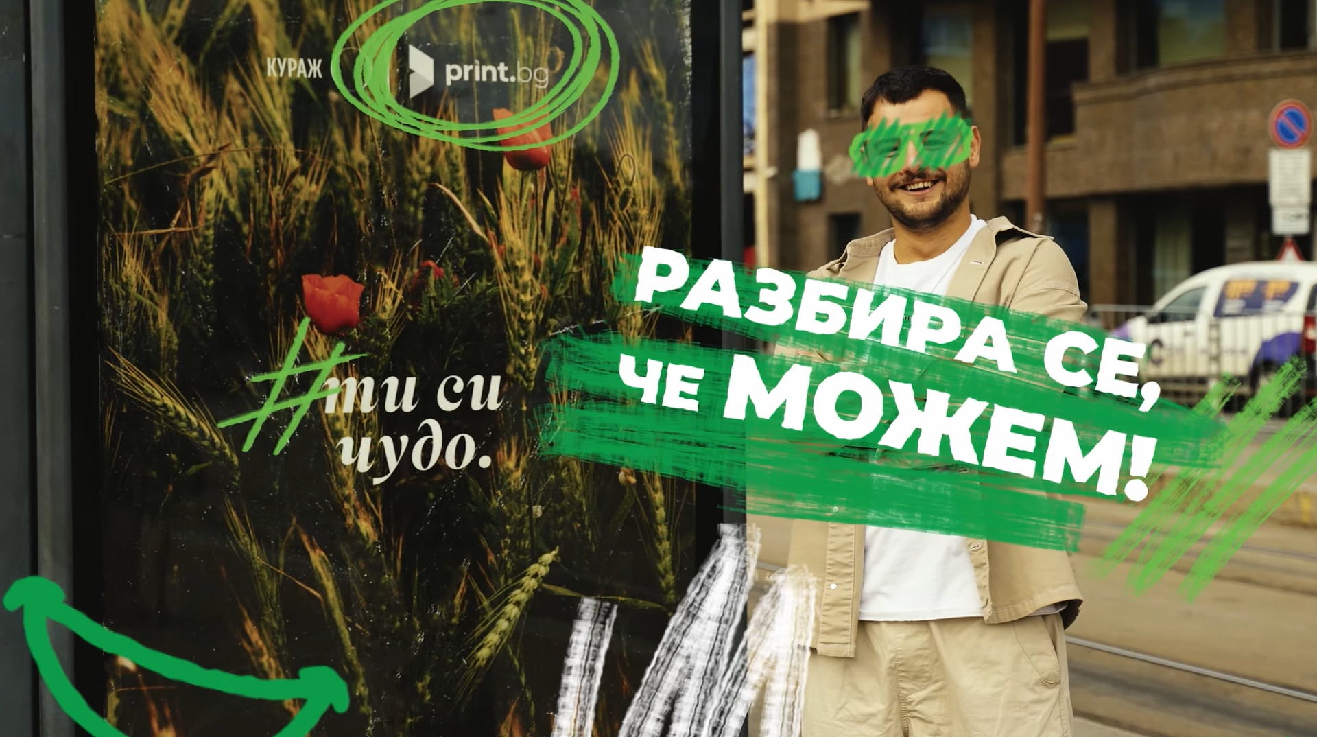
The new rebrand concept was sumarised in the hero video of the campaign. Due to tight deadlines, we used footage from past projects. I created the initial storyboard, finding visual and composition similarities between the clips to construct a narrative around the joy of the special moments and shared experiences that the printed materials create. I unified the scenes and further strengthened the storytelling by adding motion graphics such as hand-drawn transitions, typography, and elements, also highlighting the products.

play on youtube


Results
The awareness campaign and the rebranding of the social media content have led to new partnerships with young digital creators. The brand system development, including the design of numerous templates for in-house and marketing purposes (almost all of them are still in use), resulted in the expansion of the company to the Greek market with almost no help from external advertising agencies.
next case study
back to homepage
Katerina Kirilova
kreationkeen@gmail.com


portfolio homepage
kreationkeen@gmail.com
Print.bg Case Study
portfolio
about
Brand system
Marketing Campaigns
Social Media visuals
event Design
Motion Graphics
Results & Deliverables
- A brand awareness campaign that has led to new partnerships.
- Templates for in-house and marketing purposes, being still in use more than a year later.
print.bg
Print.bg is an online printing portal focused on optimising the printing process for small businesses and creatives. When I joined their team as a Graphic Designer, they had just started a brand refresh. I took a lead role in the development of their brand system and the design of visuals for the monthly marketing campaigns, social media and partners’ events.
The Challenge
The main goal of the company was to pivot away from a strictly professional look and develop a visual system that better communicates the company’s values- innovation, creativity, versatility and human connections.
I had taken the initiative to interview target clients (young creatives and small business owners) and find out how they perceive the brand. Also, getting to know the company’s work process, I came across the following pain points:

There is no clear direction or narrative that clients and potential partners can remember or identify with.
The current brand system is not flexible or scalable enough, resulting in visual inconsistency across channels.
The Print.bg team finds it difficult to handle client work while developing a brand image and often relies on freelance designers and external agencies, which increases the company's spending.
Solution & Deliverables
Working closely with the Marketing and Sales teams, we focused on creating assets and campaign visuals that would lead to consistent storytelling across channels, speed up the design process and clearly position the company as an innovative and accessible solution for anyone needing printing services.
As the majority of printing studios are product-focused, leaning into a more subtle, clean, and corporate look, we decided to put the human experience in focus and go for a bold, creative, and dynamic visual style. We balanced the brand between professionalism and whimsicality.

Brand System
Typography
Bold uppercase sans-serif typography with central alignment supports strong messaging and grabs attention. The hand-drawn font reminds of ink marks on paper and adds creative flavour.
Montserrat Black
Montserrat Regular
headings & body copy
secondary typeface
Caveat
Colours & Patterns
I expanded the brand library with pre-defined gradients and hand-drawn textures and elements to communicate energy, approachability and versatility.
Young Green
#95CA5C
Lime Green
#72B534
Naughty Green
#00913A
Earth Green
#1C5C41

Compositions & Layouts
Asymmetrical and dynamic layouts introduce motion and help avoid too rigid corporate patterns.
Brand Photography & Mockups:
Professional product photography and mockups showcase the quality and versatility of the printed materials, while capturing the clients’ stories.
Deliverables
All of the web and marketing visuals, and mockups have been adapted for the Greek market when the company expanded. The developed brand system and templates allowed us to do it all in-house, with very little help from an external agency.
Events & Print Design
We thought in detail about the full customer journey, placing Easter eggs such as witty messages and discount codes on all brand materials. This has led to long-term partnerships and client connections by leaving positive feelings after brand interactions.
“Nice to meet you!” message inside the branded business cards boxes.
Branded calendar catalogue cover with the illusion of a lifted page, revealing a piece of calendar sheet with “One month down” written under the last day of the month.


Brand Awareness Campaign Video
The new rebrand concept was sumarised in the hero video of the campaign. Due to tight deadlines, we used footage from past projects. I created the initial storyboard, finding visual and composition similarities between the clips to construct a narrative around the joy of the special moments and shared experiences that the printed materials create. I unified the scenes and further strengthened the storytelling by adding motion graphics such as hand-drawn transitions, typography, and elements, also highlighting the products.

play on youtube


Results
The awareness campaign and the rebranding of the social media content have led to new partnerships with young digital creators. The brand system development, including the design of numerous templates for in-house and marketing purposes (almost all of them are still in use), resulted in the expansion of the company to the Greek market with almost no help from external advertising agencies.
back to homepage
next case study
Katerina Kirilova
kreationkeen@gmail.com